The most striking, in-your-face, and noticeable part of Windows 8 is its new Metro user interface, and in particular, its Start screen. The Start screen is a replacement for the Start menu that has been a feature of Windows for the last 16 years. The Start screen is touch-friendly, fullscreen, and filled with live, active tiles. It couldn't look much more different from the Start menu. Microsoft is well aware of this, and has begun tweaking the Start screen in response to user feedback.
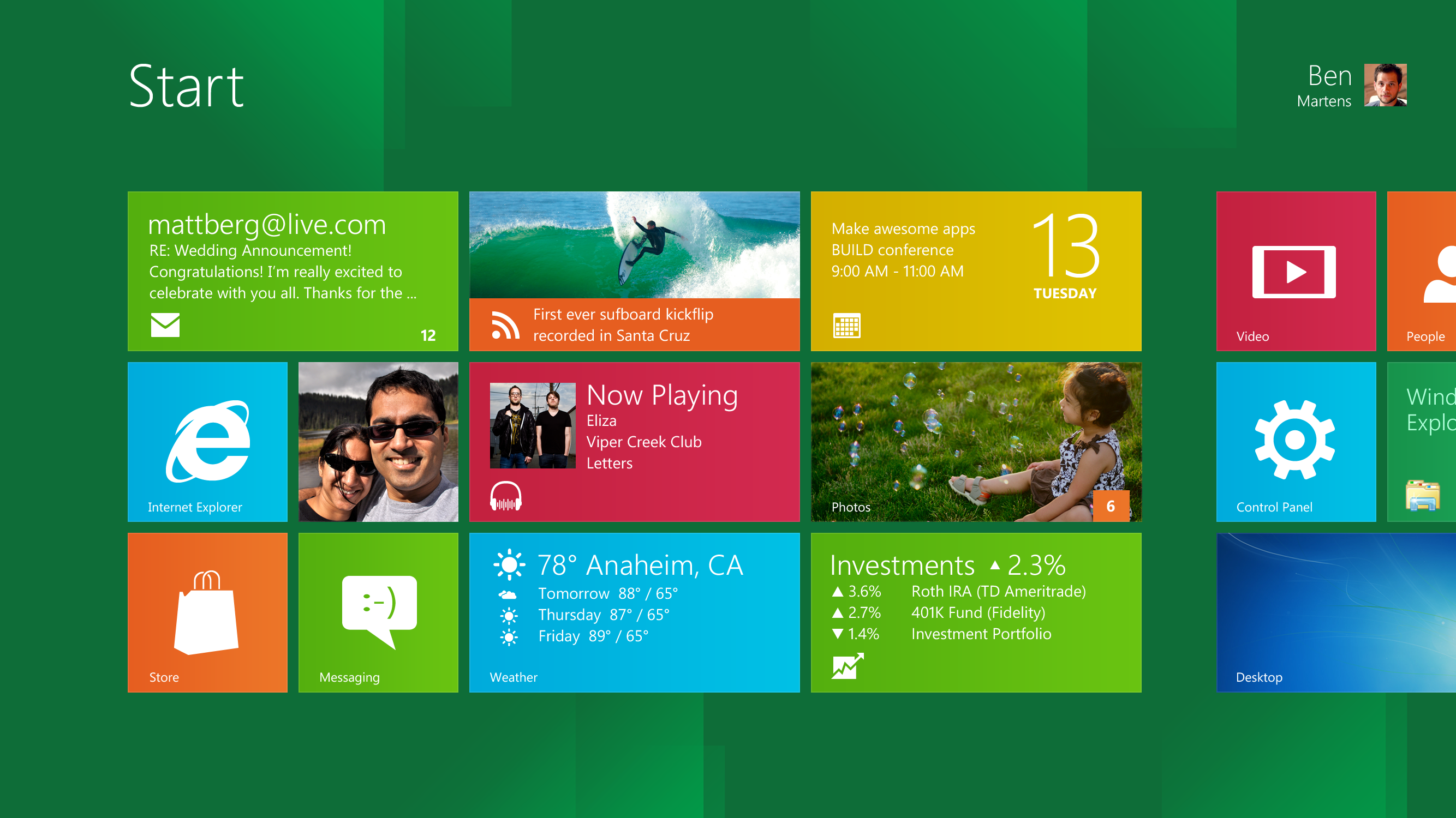
The new Start screen is definitely a big shock, and many PC users were deeply concerned that it represented a substantial step backwards. Though near-universally acknowledged as a good interface for tablet users, traditional desktop users who don't want or need tablets worried that they were going to be forced to use something designed solely for tablet users—something that really wouldn't work well with mice and keyboards. Different though it appears, we believe it still works more or less like the Start menu, and that even mouse and keyboard users won't find it too different once they get over the shock of the new look. The addition of a few extra features—demonstrated by Microsoft but not in the developer preview—such as zooming out to see more icons, the ability to create named groups, and better use of the mouse wheel, would further improve the mouse and keyboard usage scenarios.
Listening to feedback
Nonetheless, Microsoft has been listening to the concerns and criticisms about the Start screen raised by mouse users, and a blog post by the company describes some of the ways the criticism has been taken on board. The post is lengthy, with numerous pictures, diagrams, and even tables of data, and it's well worth reading in full if you're interested in some of the reasoning behind why the Start screen is built the way it is.
A few points stand out as particularly significant. The "Apps" group, the catch-all collection of icons used for launching desktop applications, will be refined. In the developer preview build, this was a simple alphabetic listing, with the result that icons from different applications would be jumbled together. Now they'll be organized into groups within the list so that all the icons from one application will be grouped together. This mirrors the Start menu's structure. Switching to the Apps group will also be simplified; clicking the Search charm will take you there directly.

The information density will also be improved. The Start screen already shows more tiles than the Start menu shows icons (by default, at least). This advantage is being further improved in two ways; high-resolution screens will gain more rows of tiles, and the Apps view icons will be packed together a little more tightly.
Making the interface better through science
What Microsoft isn't doing, even in the face of considerable resistance, is backing down from the Start screen. The changes described are welcome, and not entirely surprising, but they're merely refinements of the Start screen rather than any kind of a wholesale overhaul. Beyond those small changes, the post made the case that the Start screen is, in most usage scenarios, superior to the Start menu it replaces.
The post drew on the vast quantity of data that Microsoft collects about how people use Windows, to justify claims that it presents more information more accessibly to mouse users. It explained Fitts' Law, which says that the time to hit a target is a function of both the distance of the target and the size of the target, and applied this to both the Start menu and the Start screen to show that although the Start screen is more spread out, its larger targets and 2D organization mean that about 17 Start screen tiles are as easy or easier to hit than the two easiest Start menu locations.
Microsoft is committed to the Start screen, and convinced of its wisdom. The design is not set in stone, as the announced changes make clear—but the principles of the Start screen are fixed, and they're not going to be compromised or undermined just to win over existing users. For a company that's often accused of hurting its interfaces through design-by-committee and attempts to make the interface do all things for all people, this is quite a change.
Perhaps the most infamous example of this accusation was made by Joel Spolsky in his developer-oriented blog, Joel on Software. He criticized the plethora of shut down-related options—shut down, sleep, reboot, log off, and so on—found in Windows Vista, arguing that in an attempt to address many different narrow corner cases, the overall interface was overcomplicated and confusing. The demands of the large number of stakeholders resulted in an inferior user experience. More recently, there was widespread criticism of the new Windows 8 ribbon-based Explorer interface, and for similar reasons.
Clarity of vision
Underlying both criticisms is the idea that Microsoft's interfaces are not the result of a clear vision, a committed belief that the interface should work in a particular way, but rather that they are a result of committees and focus groups; everyone has a say in how they're put together, everyone's feedback is integrated and incorporated, and complexity is the result. Just how accurate these criticisms are is harder to assess; Spolsky is a former Microsoft employee, so likely has some understanding of the corporate culture, but cultures do change, and he left Microsoft many years before writing about the shut down options.
The Start screen appears to be different. Though the company is responding to criticism and refining the design of the Start screen, it isn't doing so in a way that compromises it. The changes that have been described don't add complexity, or extra options; they just streamline the way the Start screen is used a little. The thrust of the argument made in the blog post is, "The Start screen really is better, and here's the science and objective data that proves it's better."
One question that's been asked by many but which the blog post didn't answer is whether there will be an option to disable the Start screen—a registry key, a group policy setting, perhaps even a Control Panel setting to toggle it. Windows 8 is all but certain to include a legacy Start menu as a fall-back—at Computex, Microsoft said that screen resolutions below 1024×768 won't support the new user interface. Current builds include a registry entry that disables almost every aspect of the new user interface: the Start screen, the ribbon-based Explorer, the new file copy progress display. A facility to specifically disable the Start screen is, then, at least technically feasible.
But it may not be easy, if Windows 7 is anything to judge by. Windows 7 introduced a number of changes to the Start menu and taskbar, but included no option to revert to the old-style interface, to the chagrin of a minority of users. It had some customization options, but nothing which completely reverted its modifications. The possibility exists that Windows 8 will always use the Start screen unless it's simply impossible due to the screen resolution.
Update: Microsoft has informed us that the rules laid down at Computex were "guidance" rather than actual system requirements, so the final behavior of the operating system may simply be to use the Start screen for everyone, even low resolution users. The developer preview already acts this way. This makes a Start screen opt-out arguably even less likely.
Experienced Windows users may find Windows 8 a bit of a shock. There will certainly have to be some adjustment to the new interface. But once they are over this shock, there should be benefits in the long run. The data and rationale for the Start screen makes a strong case that it really is a faster, more effective way of using the interface. And the underlying change—the greater purity in design, the willingness to not provide every possible option and alternative—should result in a user interface that's more predictable, more consistent, and more efficient.
Listing image by Image courtesy of Microsoft
reader comments
429