When Microsoft first revealed that the Explorer file manager would be outfitted with a ribbon-style toolbar in Windows 8, responses were loud, passionate, and frequently negative.
The company recently described changes that it has made to Windows 8's Explorer in response to the feedback. These include some small modifications to the ribbon experience along with some other refinements of Explorer's new features. Though the changes themselves have been welcomed, the continued hostility toward Explorer's redesign remains.
Since its introduction in Office 2007, the ribbon has been a polarizing user interface. The ribbon's purpose was to make a package that was feature-packed but unwieldy more approachable—to enable people to find more of those features when they wanted to use them. Microsoft says that it has broadly succeeded at this goal, and there is evidence that all but the heaviest Office users regard it as an improvement.
But those heaviest users have bemoaned the way the ribbon has moved options from familiar places, and they have criticized (especially in Office 2007) the lack of customization options. While Office 2010 has reinstated much of the configurability and customization, the other complaints remain. With the ribbon expanding into such basic software as Explorer, the old complaints are being reheated. Do they have any merit?
Relight the fire
While the Office ribbon has largely been met with acquiescence—Microsoft was resolute about not providing a "legacy" user interface in Office, giving people little option but to like it or lump it—the decision to include a ribbon in Explorer has reawakened much of the anti-ribbon feeling. Windows 8 provides a new battleground on which to repeat the conflicts inspired by Office 2007.
Adding fuel to this anti-ribbon fire was the level of explication and detail that Microsoft included in its original descriptions of the ribbon. The ribbon's design—the placement of the buttons, the grouping into different categories, the decision to place things on the default tab or some other—was fundamentally not driven by taste or aesthetics: it was driven by empirical observation.
The ribbon does include some kind of logical categorization, especially for the "contextual" tabs that aren't permanently enabled—things like the "table tools" section in Word 2010, for example, that only appears when the I-beam is in a table. Still, the most important section, the catch-all "Home" section that's displayed by default, is driven by something much more basic: how often people use the feature in question. If a feature is important, it goes in the Home section. If it isn't, it doesn't.
Microsoft collects data from a broad subset of the Windows-using community through its opt-in, optional Customer Experience Improvement Program (CEIP). With this data, the company knows which Explorer features people use most often, and how they access those features—whether it be through the main menu, the context menu, toolbars, or keyboard shortcuts.
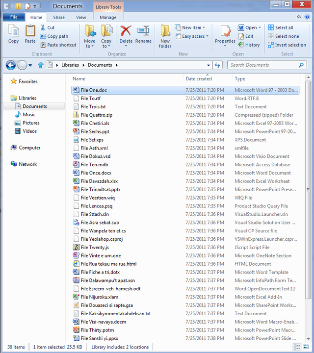
This data has been instrumental in creating the Explorer ribbons, with often-used items given prominent placement. For example, in Windows 7 some of the most-used options, including copy and paste, are not found on the toolbar-like "command bar" at all. Instead, they're accessed through the context menu. Windows 8 puts them on the ribbon's Home tab, right at the left, making them the easiest-to-find buttons in the whole interface.
Data-driven design
More than the use of the ribbon itself, it is this explanation and the data used that have generated criticism. Some of that criticism is off-base: for example, in this widely Tweeted and Tumbled post, the complaint was made that some of the Home tab's features had a usage of zero percent, calling into question their inclusion. The reason these features have zero usage is because they don't exist in Windows 7, however; that Microsoft has collected no usage data about them is not at all surprising. They are, however, reasonably logical extensions of other features, so their inclusion is not indicative of any particular problem.
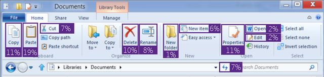
Other criticisms are more on point. Microsoft's own data shows that people use the context menus extensively and barely touch the menus and command bar. This in turn raises an implicit question: if people are finding the features on the context menus, and they are happy to use the context menus, does this not mean that the context menus are a perfectly appropriate place to stick such options? The ribbon could be seen as streamlining something that's already streamlined and accessible.
The ribbon might even be seen as illogical. There's little to link the items on the home tab, for instance, other than the fact that they're used regularly. This is not an intrinsic property of the items themselves, and it will not make sense to users of the software.
reader comments
299