
GNOME 3 is making major progress with each and every release. Six months ago, when 3.6 was close to release, I wrote about how excited I was about the improvements that were on their way. That release was a big step up from the previous version in terms of user experience. Now we’re on the cusp of GNOME 3.8, and I find myself in exactly the same position. Testing GNOME 3.8, it is a huge improvement on 3.6. It’s more effective, satisfying and polished. Basic operations like selecting a window or launching an application have seen major improvements and the overall experience feels like yet another upgrade.
The pace of change that we are managing to achieve within the 3.x series is impressive, and is a credit to the hard work and dedication of the GNOME community. In this post I’m going to describe some of the new GNOME 3.8 features that I’m particularly excited about, with a bias towards things that I’ve been involved in. I’ll also try to give a bit of background on the designs of each of these features. As always, you’ll have to wait for the release notes to find out everything that has been improved.
New applications view

This is one of the most noticeably changes included in GNOME 3.8. With previous versions, if you wanted to launch an application from the Activities Overview, you were confronted with a big grid containing all your application launchers. This could often be a bit overwhelming, and finding the application that you wanted was difficult.
The new design seeks to overcome previous limitations and to take the work out of browsing for an application. It has a few elements. First, the frequent applications tab seeks to provide a fast and easy way to launch those applications that you use a lot. One of the really nice things about this is that it is all automatic: the user does not have to do anything to enable it or to update it to changes in how they work.
The second part of the new applications view is the “All” part, which includes a couple of predefined application folders. These folders contain some of the less interesting applications (such as accessories or system utilities) and helps to lower the number of applications that are in the top-level grid. Finding applications and exploring the system for the first time is made much easier as a result.
Improved window selection

This isn’t a big new feature, but it is something that makes a huge difference to the overall GNOME 3 experience. It’s actually something that I’ve been pushing for a while, and which took a lot of work to refine the layout logic. The original bug report that we used to track this work closed with 204 comments! There were also plenty of other bugs that were fixed through the effort to improve this part of the user interface.
So what have we done? First and most importantly, we have made the window thumbnails in the Activities Overview much, much bigger. This sounds like a small change but the effect is dramatic, and it makes this part of GNOME 3 massively more effective and useful. The other thing we have done is scaled the window thumbnails so they reflect the actual size of the windows themselves. Before, all the thumbnails were roughly the same size, and this made it difficult to identify some windows. If you use a lot of unmaximised windows of different shapes and sizes, the new behaviour will be especially welcome.
Search

Search has long been one of GNOME 3’s strongest features. Pressing the super (aka windows) key and typing is an incredibly effective way to access applications and content. Since 3.6 it has also been possible for 3rd party applications to provide their own search results, and this is used by Files, Contacts, Boxes and Documents to allow you to access a range of content using a single search.
For 3.8 we have reworked GNOME 3’s integrated search functionality to make extensibility much more central. The new search results view looks great and is much better suited to aggregated results from multiple sources. We have also added a search section to Settings, which allows you to control which applications provide results, as well as the order that they appear in.
These changes are pretty important, in that they will allow applications to integrate with GNOME 3’s integrated search functionality. We’re expecting more and more applications to start using this, so that search becomes an increasingly powerful way to access content.
Input Methods

Last cycle we introduced integrated Input Methods into GNOME (using the iBus framework). One of the goals for this was to make it easy for newcomers to set up input methods, and to provide an overall better experience when inputting different languages. Since it was the first iteration for this work, the emphasis was on basic integration.
Since then, we’ve been listening to feedback, and we’ve been taking the opportunity provided by having a single integrated input methods framework to make a number of enhancements. There’s a lot of nice new features and lots of polish that have gone into this area for 3.8: we have a new input method switcher OSD (pictured above) and new character selection popups, and there’s a new Region & Language settings panel which makes adding and removing input methods easier. It’s really satisfying to see input method integration starting to pay off.
Massive amounts bug fixing and polish
Another reason to be excited about 3.8 is the sheer quantity of bug fixing that has happened this cycle. The effort to track and resolve the most serious bugs and to add that extra level of polish has been pretty impressive this cycle, and we have been pushing to get the quality level as high as possible for the release.
Every Detail Matters had its most successful round for 3.8. I was blown away by the number of fixes and small enhancements that were committed. Right now I count a total of 56 bugs fixed through that initiative alone. Some of these include some of the most obvious bugs we’ve had in GNOME 3 since it was first released.
Some of the fixes included in 3.8 are really nice usability enhancements. One area that deserves special mention is the use of pressure sensitivity for the hot corner and for triggering the Message Tray. This required a decent chunk of work in the X Server, which was undertaken by Jasper St Pierre. The result is fewer accidental triggers and a faster way to open the tray using a pointing device.
One of the things I’ve found when testing 3.8 is that it feels much more satisfying to use. Little things like the new hover effect for window thumbnails, or the nice new transitions we have in the Activities Overview simply make the experience much more enjoyable. I find myself wanting to use features just because they look so great.
Roll on release day!
There is obviously much more to 3.8 than what I have described here (such as all the Settings work which I blogged about recently). Nevertheless, this post should hopefully make it clear how much work has gone into this release and how much GNOME 3 is improving.

The application icons are still crap though 😦
Which ones, Eric?
Really it’s the overall effect of having all those various little doodles scattered across the applications menu. It looks a lot better if you swap them for say the Mint icons which are all the same shape and style.
I also think that the icons should be completely redesigned. From the very beginning, the gnome icons have always been kind of ‘sad’ and ‘plain’, and this haven’t changed with new releases. I’m actually talking about ‘all’ the gnome icons.
I know what Eric means. Some of the icons stick out like a saw thumb in the overview, like X chat for instance (see your first screen shot). The folder icons when they are small, or, the help icon looks dated, so on…
However, the icon set overall is nice. Though If the icon set were more consistent, it would be fantastic. Devils in the details an all that.
I’ve never liked the mac icons, but they are consistent and of high quality. If gnome could update a few of the icons, the ones that stick out as old looking or just badly designed, the set would be both unique, modern, consistent, and even more polished.
Hope that helps
For comparison https://docs.google.com/file/d/0B8Ew_SdbR3PKOGFhc1JTamFYSG8/edit?usp=sharing
I can’t help but 3.6 felt as a huge step backwards. Mostly because of a *huge* amount of bugs and the delay for the new message tray. I was used to open the notification bar quite often for messaging but stopped to use it. I can’t even remember when I opened it last time. They screwed up most new changes. I’m really looking forward in a stable desktop again. The 3.4 release spoiled me a lot and I can’t wait to feel spoiled again.
The new pressure sensitivity feature in 3.8 should make you happy then. Super+M can also be used to quickly toggle the Message Tray, which is something that I find very handy.
I know from experience that it hard to know where in the stack stability issues are coming from. Debugging information is always welcome, of course!
3.6: pressing Super-M again doesn’t close the Message Tray?
Navigating with cursor keys to select open windows in overview mode would be great. You can use Super to search apps and use the (cursor) keys to select and launch the shown apps – why can’t you use Super and cursor keys to select open windows (aka apps that are already launched)?
How does one toggle the User menu?
“3.6: pressing Super-M again doesn’t close the Message Tray?”
+1 for this feature!! It’s annoying to have to use “esc” key.
good job!! 3.8 would be fantastic 🙂
Yeah, I know a lot of people weren’t happy with the message tray changes in GNOME 3.6. It was a last-minute compromise for not having the proper X server features, and I personally feel the decision really hurt us.
If you have an updated X server (1.14), the new barriers should be enabled, which provides us with a much better experience. Other than that, you can use M or the overview to reach it.
Thank you & the others for the response. However, Super+M tends to trigger one of those bugs I mentioned. Chances are high that I can’t switch the focus away from the shell afterwards. E.g. it’s easily possible to select gedit in the overview but I can’t press any button, put the cursor into the GtkSourceView, etc. It happens at least once a week anyway. That’ why I still use 3.4 on my working machine. I had the same issue over there but rarely in comparison.
Your work on the X-server is my main reason why I want to update my Gnome.
I’m worried about keyboard navigation support. https://bugzilla.gnome.org/show_bug.cgi?id=644306 has been listed in the two rounds of Every detail matters, yet it’s still not fixed, and I see in those new screens many new places where I fear I won’t be able to go using only my keyboard.
Also, how is the new pressure sensitive tray working with touch devices?
I started to work on keyboard navigation support in the overview, but I couldn’t get it done in time (it’s a difficult problem — the overview code is some of the oldest code there is in gnome-shell, and it requires close to a rewrite to get everything working again), and I couldn’t get done in time.
I’m going to try to pick this up along with other overview features for 3.10, and get an early start on the rewrites.
Glad to hear that. Thanks a lot for your hard work.
Why does that overview code require a re-write? I thought one of the main goals of the restart that Gnome 2 ->3 was to create clean near-perfect foundations for the future. Needing to rewrite one of the main parts of the shell experience is alarming.
I can’t navigate overview search results with the arrow keys either, because if the search results go past the bottom of the screen, the window does not scroll down with my selection. It only scrolls down if I use mouse scroll. Issued a bug on this, had it confirmed, never got any developer support or feedback.
(I’m not exactly sure where this reply will go, WordPress’s comment UI isn’t the best — I’m trying to reply to Kostas, here)
That was always the plan, and large parts of the code are clean, but unfortunately things creep in and the overview code has never gotten the cleanup it deserves, mostly because of time constraints.
It’s partially because of changing designs over the years. Look way back on the old grid layout of gnome-shell — parts of the code designed to support this still exist today.
@Jacob I thought we fixed this, but I guess not.
I just filed some patches to fix this issue in https://bugzilla.gnome.org/show_bug.cgi?id=689681
I don’t know if this is your bug or not, but thanks for bringing it to my attention.
Thank you for posting and taking the time to include screenshots. As a lot of us are looking to move to different environments and distributions, it sounds like Gnome 3 may be a very nice alternative to Unity etc
Mostly looks lovely, but what’s with the alignment of the search provider icon and the first search result icon in https://afaikblog.files.wordpress.com/2013/03/search.png ? 😮
I think that would look much better if the Contacts icon was center-aligned with the GNOME Documentation icon, instead of offset as it is currently. Is it something that makes sense in motion?
Ha! Please file a bug for that one. 🙂
Hi Allan, everything looks great!
One thing Im still missing in the window selector is the capability to move the windows using drag-n-drop to reorganize it (like we can do with workspaces). Being able to put the browser in the same position in the overview (the one Im used to) and other windows in the same other would help a lot on productivity since you can just click on the right thumbnail by the position, not needing to look at all of them and find which one you are looking for.
Is such thing on the roadmap ?
There’s a tension between ensuring that window thumbnails are as big as they can be and reorganisation. Also, I suspect that reorganising the thumbnails would be hard to do from an implementation point of view.
Reorganization does not really make sense using DND because you don’t see the same positions in the overview so it be completely random.
But in 3.8 there is a little easter egg there … you can change the stacking order of windows by holding down Ctrl and clicking on window thumbnails.
Glad to hear the development speed has been increasing or at least staying stable rather than decreasing. I was afraid some of the developers would have grown sick of the constant negativity and FUD being spread by a very very vocal part of the community.
I’d like to see how tweaked windows selection will change the workflow as now I rely on 2 extensions that slightly alter the default UX (one for thumbnails in Alt-tab, the other the absolutely brilliant Dash-to-Dock) when I have to deal with small numbers of windows that can be switched without going to activities.
The search changes look good. It’s a feature I’ve always much appreciated in Shell, but the presentation of results hasn’t been very good for files with long names e.g PDFs, or media files.
Is there a documentation how to migrate an existing search provider extension from version 3.6 to 3.8?
I like Gnome Shell, but I hate the lack of documentation.
Hey Bernd, it’s a simple dbus call as before: https://developer.gnome.org/shell/unstable/gdbus-org.gnome.Shell.SearchProvider2.html
Going forward, the recommended way to make search providers is to use a separate process along with the DBus API that Allan mentioned, rather than an extension.
This puts less in the compositor, which keeps it from blocking too much when typing during search results, and makes your system faster and leaner.
Nice improvements! But look at the size of those icons. I can understand the need for bigger icons for those with less than 20/20 eyesight. But for the rest of us, at least make the icon size configurable. On my 24″ monitor the icons are even bigger than my thumb and that’s just a waste of space when half that size or even less works fine too. I’ll get of my soapbox now 🙂 Keep up the great work. I look forward to trying out the latest and greatest GNOME with Fedora 19.
Pieter, to my knowledge the icons are the same as in all previous versions of GNOME 3.
Really the size has nothing to do with the ability to recognise an application, and is actually intended to ensure that too many icons are not displayed at any one time.
Wouldn’t the best way “to ensure that too many icons are not displayed at any one time” be to simply limit the number of icons displayed?
I’d agree that much in Gnome Shell seems oddly over-sized.
Maybe you can check the number of displays and only limit the number for singular displays. Having more than one display, I can tell you I want Gnome3 to use it well – I want quantity and orientation in one image – if it were possible, I would mandate all Gnome developers work with triple 1080i 27″ system just to evolve some much needed empathy. I have financial users that are rapidly passing 3 on there way to 4-6 displays, and they won’t touch Gnome3.
I like Gnome Shell, but it seems to me that the Applications Overview is really a menu with big icons. I’m not sure how segmenting it along lines thought to reflect user behavior, while useful, is an advance. Standard menus have been doing that for years.
Here’s the real problem: Icons in docks, panels, or in some other always visible little piece of screen real estate, solve the problem of quick access to a few often-used applications. The problem is in providing access to any of the not-often-used hundreds of executable files we have on our machines. Menus aren’t the answer. No one seems to have a better approach, though.
The Applications Overview could be so much more. It should be possible for Zeitgeist to produce a graph of coincident application usage by the user (usage concurrency and window peerage) and rather than a simple frequency promotion, the Applications Overview could display apps with the highest degree of coincidence with those currently in use – it could even do some grouping for a multi-app launch scenario. which one could then “pin” as folders among the traditional ones.
It all looks fairly good but what about basic functioinality like the Printer and User administration. Those are both almost next to usless right now. One actually has to launch the ols system-conf-printer to do any good and just try adding yourself to another group, nope!.
Printer configuration got an overhaul for the 3.6 timeline, and it’s really functional now. If you have any issues about why it’s not usable for your situation, please let one of us know.
As for the user situation, I have to ask — what’s the reason for adding yourself to a group? There’s lots of different reasons, and it would be nice to add a UI that suits your specific needs. I have a fairly recent Fedora install, and there are 70 groups on my system — I don’t think it’s the best idea to show a dialog containing 70 items where most of them are irrelevant to some user.
Well for example when one runs QEMU or Virtualbox you must add yourself to the correct group. And really groups have been a part of Linux always, it makes sense one would want to deal with them.
Also for printers, if you mean the conf that comes with 3.6, one can”t even get to printer properties where all manor of items are configured such as second tray etc. If this has been overhauled for 3.8 good but as it stands in 3.6 it’s non-fucntional.
The core interface has become quite exceptional. Focusing on the details has really amped up the quality and professional look and feel of GNOME.
I’m very impressed with what the community has achieved. I’m sorry to say, however, that I would gladly trade a step back in the Shell for a few apps. Sure, we have plenty of apps, but applications which follow some of the new HIGs that I can use in daily work and play would be quite gratifying.
While I know it’s difficult, and there is still room for improvement in every area of the desktop, the apps are the most obvious sore spot for me. I suppose this is a much deeper problem, since it requires some work on the developer experience to get things rolling faster and making it easier to create the UIs with standard components.
Still, I’m proud of what the community is doing, and GNOME 3 is definitely a good example of how a community can persevere through difficult times to achieve a remarkable result. I hope we can all improve it together.
There is a lot of work going on to make developer experience better. There was a DX hackfest last month [1] (hopefully there can be a second one at a later date) and there is a GTK+ hackfest [2] coming up, where the focus will be on making it easier to use new widgets etc.
1. https://live.gnome.org/DeveloperExperience/Hackfest2013
2. https://live.gnome.org/Hackfests/GTK2013
Those are some really exciting changes and I know that there are more brilliant improvements in the 3.8 cycle that you haven’t mentioned. Can’t wait to try it out on Arch… I have been following the development of Gnome 3 since before it’s release and I have to say it has been an amazing journey. Keep up the good work guys and God bless your ability to ignore the insane amounts of FUD generating around Gnome 3 and it’s shell…
a couple of things that i’m baffled aren’t done in GNOME out of the box:
1. single click by default in nautilus and support in the file picker
2. easy to have login-less experience (and automatic unlocking of the login keyring in this case — the login keyring will be needed right away after login if you use gnome online accounts)
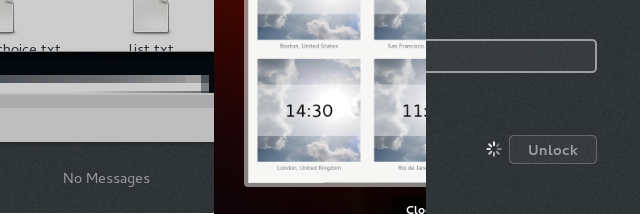
Point #2 in particular has seen massive regressions for me between 3.6 and 3.8. In 3.6 i could set my login keyring password to “” and it was getting unlocked. This is buggy in 3.8 (i have opened https://bugzilla.gnome.org/show_bug.cgi?id=692826 which was closed as a duplicate but it’s still not marked as fixed as of today), and in 3.8 i have the choice: either no login and no online accounts, or login and online accounts.
appart from those two things, yes gnome3 is amazing to me. oh well.. there is also the umbelievably slow login time. i’m pretty sure it was much better in 3.6 compared to 3.8, too. https://bugzilla.gnome.org/show_bug.cgi?id=645756
Shameless x86-only gnome-shell bug attention attempt: https://bugzilla.gnome.org/show_bug.cgi?id=692706
Looks great, thanks for the article, really glad Gnome is making progress.
on “Improved window selection” please, please, get inspiration from https://extensions.gnome.org/extension/302/windowoverlay-icons/ this makes it much, much easier to find the window you’re looking for. Because typically, all windows are kind of white/grey.
I am excited about the new search. Maybe I won’t have to use gnome-do anymore. Thanks for all the work. I really love using gnome for day to day work.
Great work guys
I’de really love to see the bug fixed that makes the screen flash blue during screencasts with ffmpeg while running the proprietary nvidia driver. I am not aware of any bug report about it but it only seems to happen with a combination of proprietary nvidia driver and ffmpeg screencasting like here : http://www.youtube.com/watch?v=Zx1K7rxbZZ0
It doesn’t happen while using the nouveau driver though… so It is likely an nvidia issue…
Apart from that…. would be cool to see category buttons (similar to Unity’s interface) rather than get rid of it. A built in way to customize/tweak theme settings such as panel/menu transparency and to actually change gtk themes/icon themes etc without relying on a 3rd party hack tool such as gnome-tweak-tool. I’m sure I can think of a lot more… but the baby steps taken look quite impressive from 3.0 – 3.8. Can’t even imagine how amazing gnome-shell will look and operate come 4.5 😀
“without relying on a 3rd party hack tool such as gnome-tweak-tool.”
you do realize that gnome-tweak-tool is written by GNOME developers, is designed by GNOME designers, uses sanctioned GNOME 3rd party API, and is hosted on GNOME infrastructure? what makes you think it’s a) a hack and b) 3rd party?
it’s a tweak tool, for people who want to tweak the UI without going through the low level settings. it does exactly what it says on the tin. I see no reason in making the Control Center UI more complicated to allow for tweaking, when we already have a tool that has tweaking as its pure raison d’être.
One thing that I would like to have changed is when looping over applications with ALT+TAB. When there are more than one window open in one application you have to change to ALT + PIPE (|). That is something I always forget and it is annoying.
Otherwise: I think G3 is great , and I have it as default on my U 12.04.
That’s been fixed in GNOME 3.8. Alt-Tab works as the traditional window switcher while Super+Tab is the new app switcher by default.
Wait, what? Any chance of getting a link to the bugfix or a screenshot because this sounds like a huge design change.
Hmm, here it’s Alt-` to navigate windows within an application.
btw, it took me a few weeks to break my old habits, but I like the new way of navigating. I used to install that shell extension to change the behavior back to the gnome 2.x / Windows-style default (navigate all open windows).
Maybe this extension can help (I think it’s the one I used to use): https://extensions.gnome.org/extension/38/windows-alt-tab/
Good work on Gnome3. Despite all the flack it gets, I do like how fluid it feels most of the time. I just wish it was more configurable. Having a specific workflow forced on me is rather infuriating.
Every release of Gnome gets me excited because I think it will come with some basic configuration options. But I am always disappointed. Do you realize that Gnome could DOMINATE the desktop if you simply add a few basic things? Specifically, things like:
– Ability to configure icon/text sizes
– Quick launch bar on desktop (especially for those of us without a windows key on our keyboard)
– Ability to configure minimize/maximize buttons on windows
I realize that much of this functionality can be obtained via extensions, but they constantly break with each new release and that makes the Gnome “experience” quite terrible.
Who determines what does or doesn’t make it into Gnome? I’d be willing to do the work myself, but I’m afraid that it would just be rejected because it threatens the one true workflow.
My grandma certainly don’t give a shit about configuring the windows buttons. (see my point here).
Hi,
what would be appreciable is to have this virtual keyboard thing that appeared with 3.6 at gdm login window at least to reflect the XkbLayout defined in the Xorg.conf, or better, not to appear if the screen is not a tactile one.
Second wish (if I may) would be to directly have the search input on the desktop if typing suddenly on the keyboard rather than having to go to activities, etc…
Why not having the dock extension by default enabled…..
> Why not having the dock extension by default enabled…..
A dock isn’t necessary or wanted in my workflow, you might be able to make a better case for making it configurable, but it’s already an extension so what’s the problem?
Seems promising, but still something like Cairo-Dock is very useful to complete the desktop.
Hello can we get gnome 3 looks more like gnome 2, gnome2 was good and i’m not sure what to use these days.
When selecting an input language, Chinese should use the Chinese character for “Zhong” instead of the letters Zh. Japanese and Korean both use native characters from their respective writing systems, and it is only logical that Chinese input would have similar behavior.
Hi Brian, can you file a bug for this please? Use the gnome-control-center product and we’ll figure out what needs to be done.
Hello,
it seems that from 3.8 (or was it 3.6?) not all the applications displayed in the application menu appear when searched through the search box.
Or maybe I should say: only the gnome built in applications are searchable through the search box. I agree that you redesigned the search API, but at least name-match should work for any application in the menu….