After three Jelly Bean releases in a row, Google has unleashed a major revision to the world's most widely used operating system. With the Nexus 5 comes Android 4.4 "KitKat." KitKat brings a ton of enhancements: support for hidden system and status bars, printer support, and lower memory usage. It also has a number of user-level improvements, including a new dialer, a Google-infused home screen, and a whole pile of UI refinements.
The lower memory usage is particularly important because Google hopes this is the feature that will finally kill Gingerbread and other older versions of Android. Ice Cream Sandwich raised the system requirements for Android quite a bit, and to this day you still see lower-end phones shipping with Gingerbread because of the lower barrier to entry. Unfortunately, the only device that currently runs KitKat is the Nexus 5, which has a whopping 2GB of RAM, so there isn't much memory testing that we can do right now. We'll have to wait for actual low-memory hardware running KitKat to evaluate any of the low-memory requirement claims.
We can take a look at just about everything else, though. We believe KitKat is the biggest Android release since Ice Cream Sandwich. Google has touched nearly every part of the OS in some way, so there's a lot to cover.
The home screen/Google Now hybrid
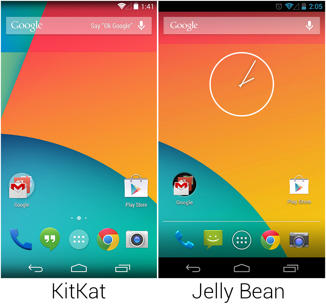
The first thing you'll notice when you start up KitKat is the new launcher. KitKat does away with the standalone launcher and actually runs the Google Search app as the home screen. The biggest visual changes are the status and system bars, which are now transparent while on the home screen. This idea first debuted in OEM skins, and it's a great visual improvement over the black bars in Jelly Bean.
The transparent bars have a gradient at the top and bottom, so the white icons will still be visible on a light background. The top gradient has a weird visual effect, though—it's easy to interpret as a shadow, which makes the display seem farther away from the glass touch surface than it really is. Even in the above screenshot, the top of the KitKat screen seems "embedded" into the webpage. On the Nexus 5, this just makes the backlight look defective.
The transparent bars are part of a real attempt by KitKat to be "brighter" overall. The status bar icons are now all white, and folders have switched from black holes to frosted white circles. The line separating the dock from the rest of the home screen has been replaced with dots that indicate which home screen is currently being displayed, similar to iOS or TouchWiz.
The above screenshots are roughly to scale in order to illustrate how huge the icons have gotten on the new launcher. The enlarged icons have bumped the app drawer down from a 5×5 layout to 4×5, and the "App" and "Widget" tabs have been removed for a cleaner look. We'll bet most people use the widget drawer once, set everything up, and never use it again, so hiding it is a smart move. The home screen font and "toast" pop-up messages have switched from a normal Roboto to Roboto Condensed.
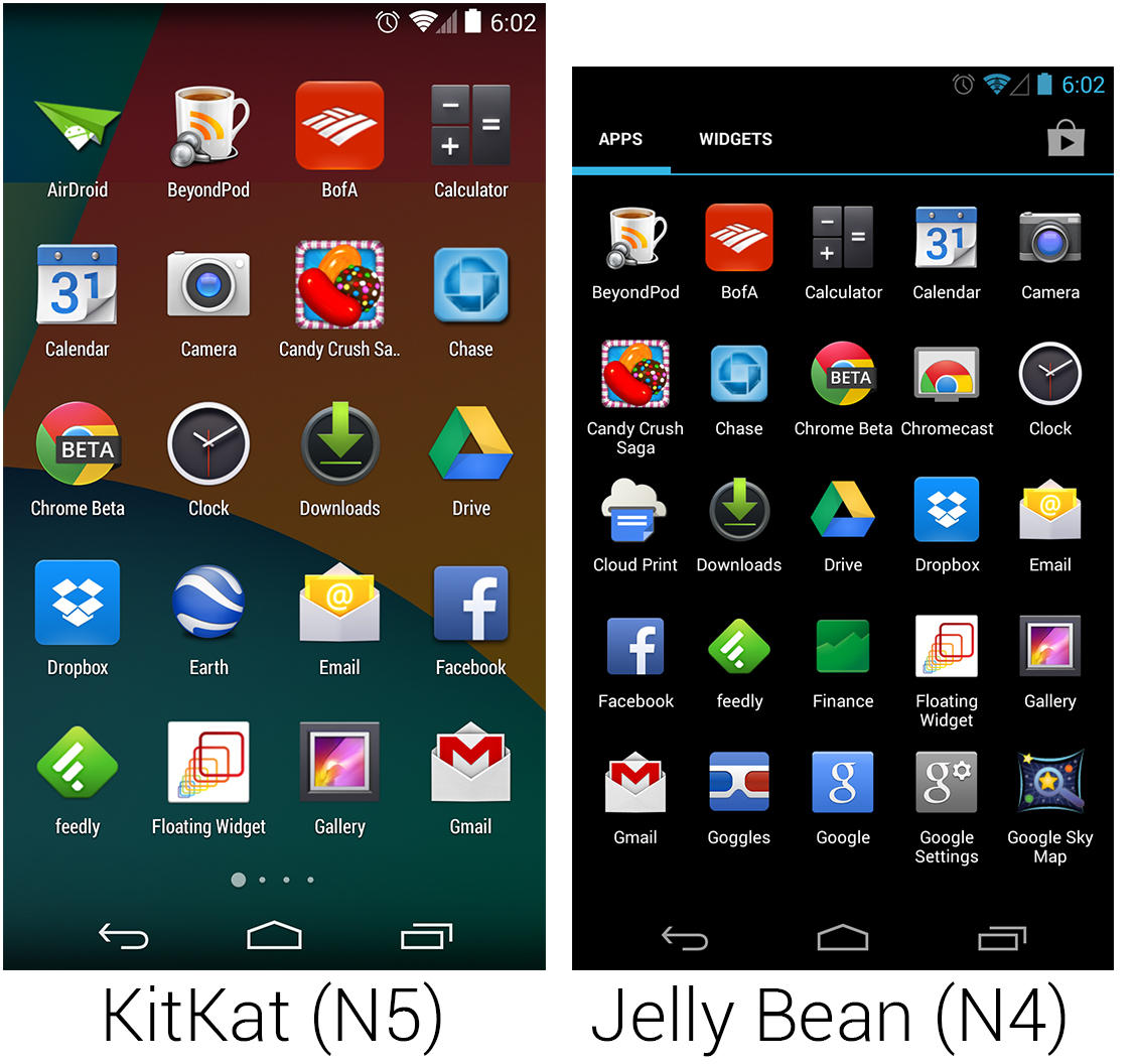
In another brightening change, the app drawer background now displays a slightly darkened version of the home screen wallpaper instead of the straight-black background of Jelly Bean. The home screen dot pagination is present in the app drawer, too.
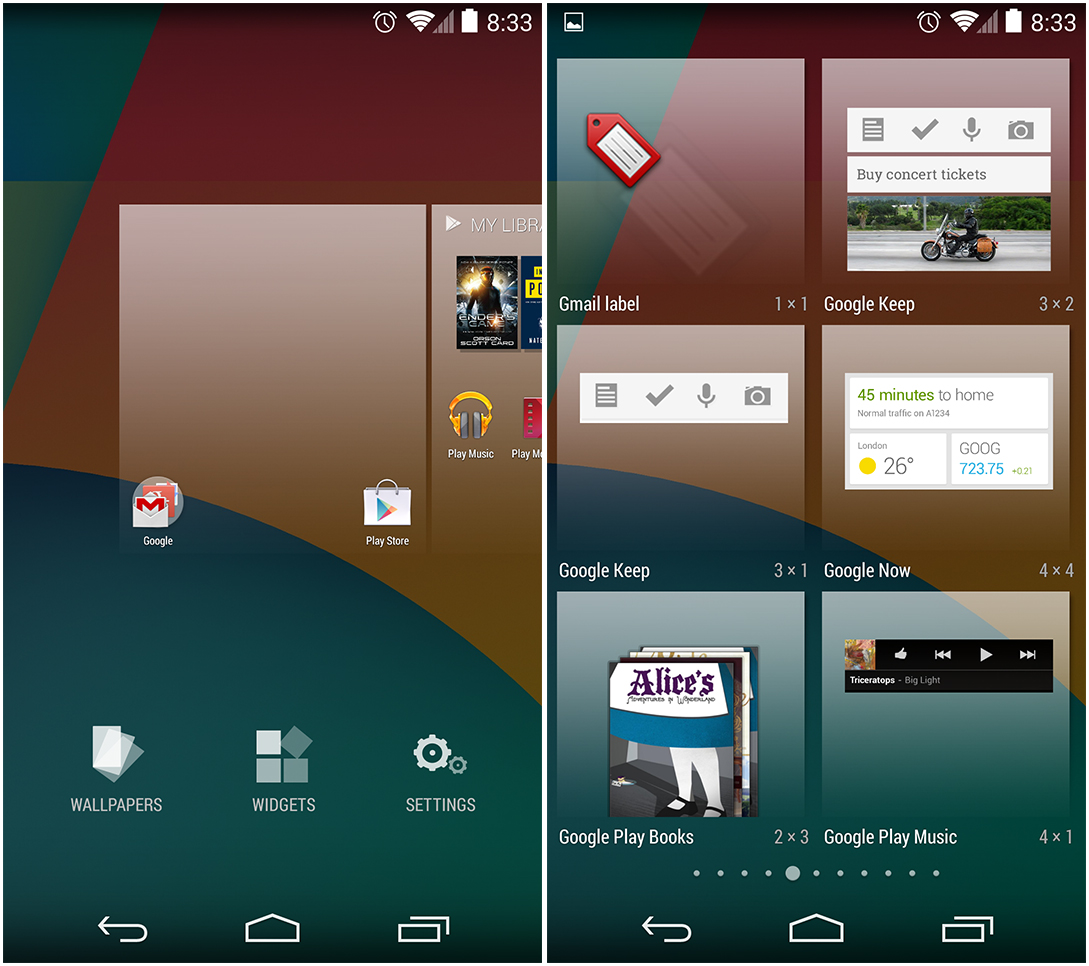
Widgets are now hidden behind a long press—just hold down anywhere on the home screen and they'll pop up. The zoomed-out screen gives you access to wallpapers, widgets, and settings. The transparent widget interface looks better than it did in Jelly Bean (which had a black background), but it's still the worst possible list type for something like this. A horizontal list would have fast scrolling; a contacts-style letter scrubber would be even better. But as it is, it takes 10 horizontal swipes to get to the end of the list. If Google is really attached to a horizontal list, make a quick scroll happen if the user slides their finger over the dots at the bottom—currently touching the dots does nothing.
A similar interface is shown when dragging an app out of the app drawer. There's no hard limit to the number of home screens in the new launcher—just drag an icon over to the right side to of the screen to create a new home screen. Like the widget drawer, there's no way to fast scroll. If you decide to create a million home screens, your thumb will get very tired.
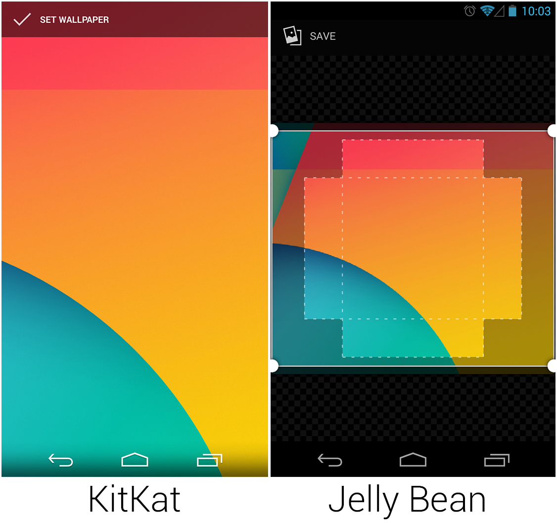
The new wallpaper cropper is a huge improvement over the incomprehensible Jelly Bean implementation. The old wallpaper cropper showed you boxes inside of boxes inside of boxes in an attempt to display the vertical and horizontal crops. KitKat has gone full WYSIWYG—just drag the image around, pinch zoom, and hit "set wallpaper." Whatever it looks like in the preview is what you'll see once it's set. You can even set a perfect 1080×1920 as the full-screen background, and KitKat will intelligently disable the parallax scrolling effect. Jelly Bean would insist that you crop the background so that the scrolling would work.
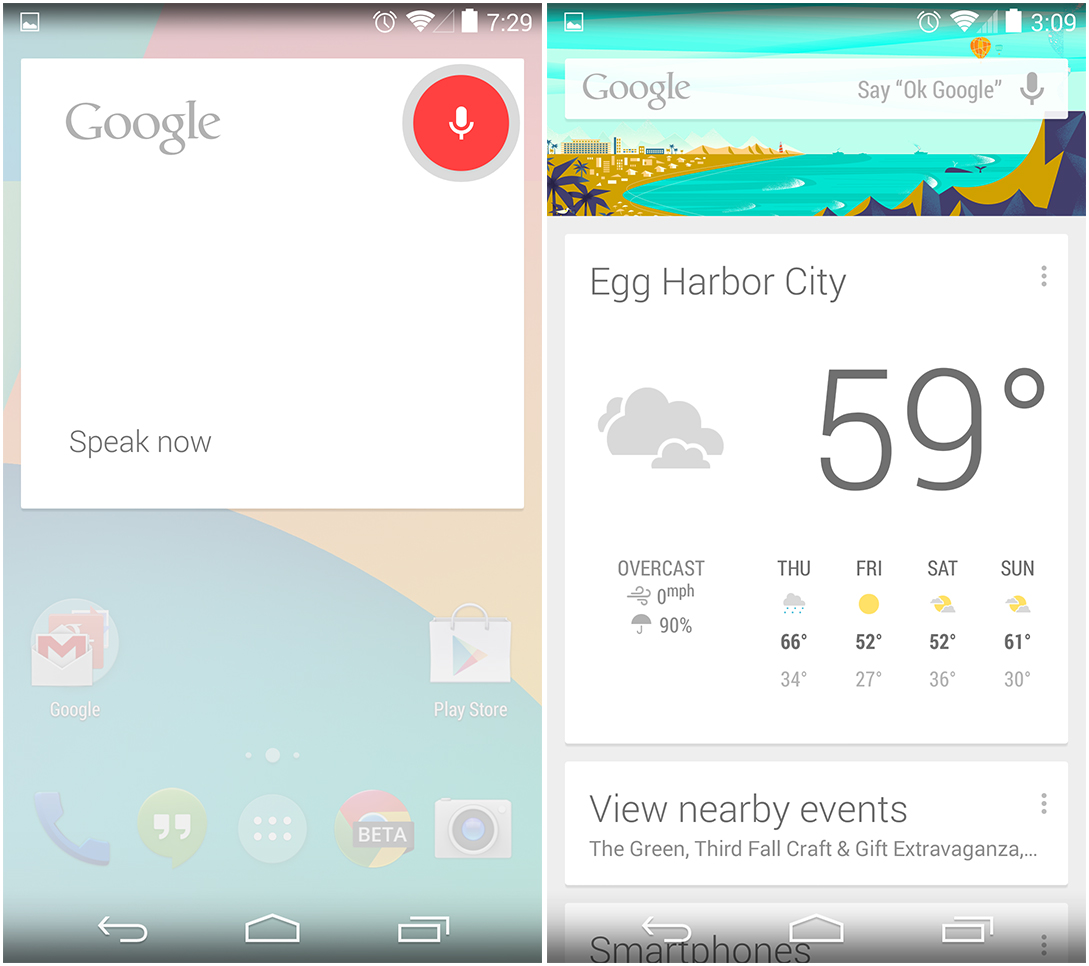
We mentioned that the home screen was actually the Google Search app. The benefits of this are that you can now say "OK Google" when the home screen is on, and voice search will open and start listening. This is extremely useful and saves you from having to hunt for the voice command button. Still, it can't hold a candle to the always-on (even with the screen off) listening of Google's other phone, the Moto X. The "Say 'OK Google'" help text shows up for the first few home screen visits, but it hides itself after the voice activation feature has been used a few times.
The leftmost home screen is not a home screen at all—it's the new home of Google Now. Previously, Google's predictive search cards were accessible by swiping up from the system bar, but that was no doubt difficult for new users to discover. The swipe-up gesture still works, but the primary way to access Google Now is this leftmost home screen. Google Now and voice search work exactly the way they have in previous versions.
Above is what the launcher looks like in landscape mode. There is still no auto-rotate support—if you turn the phone sideways, the launcher obliviously stays vertically oriented. If you frequently use the Nexus 5 in a car dock, this is a deal-breaker. We really don't understand why every screen on Android supports auto-rotate except for the most important one (luckily you can fix this with an app). Also noticeably missing from the new launcher is any kind of customization options. The Google Search bar cannot be removed, you can't hide icons from the app drawer, and you can't add screens to the left of the home screen.
reader comments
225