


Cantarell is the default font in Fedora Workstation. It comes courtesy of the GNOME desktop community, which designed and chose Cantarell. Recently the maintainers of Canatrell have done a great deal of work on the typeface to improve readability and appearance. There are now two maintainers, Jakub Steiner and Nikolaus Waxweiler, who both contribute to the GNOME desktop environment as well as Cantarell. Here’s a sample of the typeface:
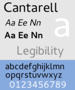
A little sample.
These improvements will be shipped with Fedora 24, which is scheduled for final release in June.
What happened to Cantarell?
We talked a bit with the maintainers to get some more information. According to Steiner, maintenance of the Cantarell font had become quite stagnant. This lack was especially apparent when it comes to font hinting.
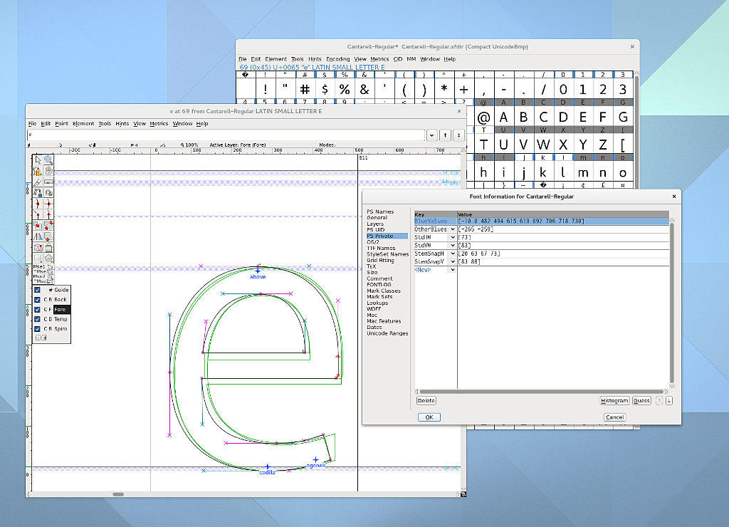
Cantarell hinting work.
Hinting is a process that helps make a font more readable. Hinting requires precision when modifying a typeface. The developer must make use of zones that affect how the font is adjusted at different sizes. When a font is correctly designed, these zones match your font type and make it look clear and readable. To achieve this result, the design must be consistent and regular.
For instance, the horizontal zones defined in a font (see the image above) are called “blue zones.” If the lines of your typeface go outside of the blue zones, the hinting algorithm simply ignores them. This results in odd or inconsistent type appearance at different resolution or letter sizes.
Waxweiler found that Cantarell was in a somewhat poor state, with inconsistent diacritics and clunky appearance at some common resolutions.
Many fonts, one system.
Waxweiler set about cleaning up the Cantarell font, fixing for example the blue zones to achieve a more harmonious look. He also addressed a number of issues concerning Cyrillic. In addition, Cantarell now has all its diacritics and accented glyphs fixed in the font. Central European users who make use of these marks will have an improved experience and see characters correctly now.
Will I see the difference?
The new version of Cantarell is already available in Fedora 24. The adjustments in the new release provide a more pleasant default experience for Fedora users.
What if you’ve changed your font settings, for instance with the GNOME Tweak Tool? If you upgrade to Fedora 24, the Cantarell font will still be upgraded. But its appearance is subject to your font settings, which are correctly retained when you upgrade.
You can restore these settings to their defaults using the Tweak Tool, or you can use these commands in a terminal:
gsettings reset org.gnome.desktop.interface font-name
gsettings reset org.gnome.settings-daemon.plugins.xsettings antialiasing
gsettings reset org.gnome.settings-daemon.plugins.xsettings hinting
gsettings reset org.gnome.settings-daemon.plugins.xsettings rgba-order
If you have any issues with this font, please file a bug in the Gnome Bug Tracker.
Image courtesy Marcus DePaula – originally posted to Unsplash as Untitled

Nikos Roussos
I can see that Cantarell still has no non-latin characters. So it’s a not an option for most people. For instance if you visit a website with Firefox that has non-latin characters on the title you get half the title with Cantarell and half with some other font.
I usually switch to Liberation, which I think is more suitable for default font in a workstation. At least until Cantarell get full unicode support.
Kostic
Actually, it does support Cyrillic characters but no Greek ones.
Nikos Roussos
Yeap. Greek are the ones I want 🙂
Sylvia Sánchez
Sorry for that, but development is still going and you can fill a bug so they know what is working and what is not.
Thank you!
Jonas A. da Silva
What software is that on the screenshot labeled “Cantarell hinting work.”, the one where the “E” letter appears?
gilgam
Fontforge
Serge Matveenko
Canatrell => Cantarell
Sylvia Sánchez
Yes, I’m sorry, I just noticed. But I can’t edit the article.
Thanks for pointing out whatsoever.
Serge Matveenko
How does Cantarell deal with faces different from Latin? Is it looks good for Cyrillic also?
Sylvia Sánchez
It works well with Cyrillic because that was one of the main points the developers worked on. But still has a problem with Greek, as another user stated above.
Keith
I appreciate that Fedora has finally looked at this – although it’s not perfect it’s a whole lot better! Fonts has always been an issue and something that needed to be updated/changed/tweaked right after install.
I did notice the difference as soon as I first booted up F24-Beta and was rather pleased to see that I didn’t have to change anything 🙂 – Great work!
Sylvia Sánchez
This is why we wrote this article. There were many complaints about the way fonts looked in Fedora, so is awesome to bring good news on the topic.
jaroslav
What’s the app on the screenshot?
gilgam
fontforge ?
Sylvia Sánchez
Fontforge if I’m not wrong.
Dusty Mabe
Any tips on taking advantage of this in Fedora 24 using i3wm?
Sylvia Sánchez
The update is desktop independent. If you use Cantarell, you will notice the improvement.
Saurav Sengupta
Cantarell has improved, no doubt, but font hinting in general on Fedora is still not quite up to the mark. It is very apparent with some characters, such as the letters ‘v’ and ‘w’ and the ‘/’ character. In particular, diagonal lines in characters such as these are not rendered smoothly – they still have a jagged appearance. Daniel Renninghoff has packaged Infinality for Fedora 23 and 24 (https://danielrenninghoff.com/2015/11/22/infinality-ultimate-bundle-packaged-for-fedora/), which is currently one of the better options for improving the general hinting on Fedora.
dtantsur
I wonder why this font is not by default in the MATE edition. The default fonts looked not so well on my Thinkpad T460s.
Sylvia Sánchez
I don’t know, it’s been well over a year I don’t use Mate. But on Cinnamon isn’t default neither.
Leslie Satenstein
Before Cantarell my old display of fonts was clear and easy to read. With Cantarell, I find no perceptable difference. And I use « French characters » as well as Spanish.
My video card dates from 2009, and I suspect that more recent video cards distort their images somewhat.
Nevertheless, I welcome Cantarell if it is also to be used as the default for applications developed for Fedora.
Sylvia Sánchez
Maybe you’re right. Happens the same to me (I translate to French, Spanish & Portuguese, figure out!), but I think the main problem was on Cyrillic characters. At least, related to Cantarell, I don’t know other fonts.
Krystian
At least – something will change! 🙂
Fonts was always a Fedora issue – it was really hard to use Fedora, without additional fonts engine like Infinality (or other tips&tricks to improve rendering).
Sylvia Sánchez
And there are more changes in the future! 😀
Clinton
I like the new font!
Peter Pan
I wonder if I still have to use freetype-freeworld from the rpmfusion repo for better font rendering. Ubuntu fonts looked so much better compared to Fedora.
Sylvia Sánchez
What about doing so, comparing results and sharing them with us?
It would be a very nice follow up to this article to compare both font hinting and how they look.
woprandi
Thanks for your great work
It could be good to have before / after screenshots.
Sylvia Sánchez
I wanted that too, but I couldn’t find any and I hadn’t a live media to try. I’m sorry.
Smin Rana
Thanks for working on this. I really love the font. Can’t wait for 24 release.
Sylvia Sánchez
Neither I! I’ll be testing Mate Compiz and Workstation this week. But for some weird reason, in Mate Cantarell isn’t default.
Etna
Bah, fonts.
I just copied over the Calibri fonts from my Surface tablet over into Fedora and ran fontconfig. I now have beautiful fonts compatible with the rest of the Windows-using world.
Sylvia Sánchez
Well… I find Windows fonts utterly boring but that’s about personal preferences I guess.
Sumit Bhardwaj
I upgraded my main machine to Fedora 24 workstation 2 days back and based on this article, I removed all the font customizations as well as uninstalled freetype-freeworld package, and to my surprise font rendering is actually improved. Great work guys!
Although to make it a bit more to my liking, i am using following settings in /etc/X11/Xresources file:
Xft.hinting: 1
Xft.lcdfilter: lcddefault
Xft.antialias: 1
In Gnome Tweak Tool, Hinting is set to medium and Hinting Style is set to Greyscale. Its just perfect 🙂 I think you guys should add the lcdfilter setting by default as most of the monitors are LCD these days.
Sylvia Sánchez
Actually, many of screens nowadays are LED. Mine laptop is one, although my netbook is LCD.
In any case, I’m happy you could see the improvement. I like Cantarell a lot.
Sumit Bhardwaj
Ya, actually my Thinkpad X240 also has LED screen, and basically on these panels, the lcddefault filter makes rendering a bit more ‘sharp’ (for the lack of a better word in my limited vocabulary). I don’t know what it does technically, but this is what I perceive.
I like Cantarell a lot too, my GUI font is always Cantarell. However, previously I used to install freetype-freeworld for better hinting. Now it seems, that is no longer required. So Yay! 🙂
Sylvia Sánchez
I have numberless fonts, so to me it’s more about picking one than installing. I never uninstall fonts, I always install them!
Martijn
LED is just the backlight technology, the screen is still LCD. The thing is, lcddefault only applies to rgba antialiasing and not to grayscale. The reason you had freetpye-freeworld installed previously, is that lcddefault is not included in the freetype package that is supplied with Fedora. That’s probably because of patent issues. If you are content with grayscale antialiasing, you’re all set. You can leave lcddefault in your Xresources file, as it won’t do any harm. If you’re going back to rgba, it’s advised to install freetype-freeworld again, so lcddefault is actually applied.
Sylvia Sánchez
Oh! Thank you! I didn’t know all this. It’s really useful.
Brad
This is great news! Fedora fonts from a clean install have needed lots of tweaking for years now.
Sylvia Sánchez
Glad this is useful!
Robert Smol
So the changes are done to the font only or to the whole system, just curious why I can’t use this on Fedora23.
I also see Cantarell on https://www.google.com/fonts, is this the latest version?
ifoolb
Nice work, now this font looks as good as the one on OSX.
Sylvia Sánchez
Great!
I guess…
VSE NN
Cantarell is quite good. But it’s rather narrow and high and I used to Droid family since the time of F14 or even earlier. It has quite good Unicode support and looks sharp, it has good hinting: comparing, for example, with Liberation or DejaVu families. It’s a pitty that it’s not developed any more. But now I tend to prefer “Linux Libertine O” and “Linux Biolinum O” from linux-libertine-* packages.
Sylvia Sánchez
Yes, that’s about preferences, I use fancy fonts in my desktop and apps… and everywhere. But given this is the default font in Workstation, I think this is really important to all its users.
And more for the newcomers.
Andrew
I’m really happy to hear about these improvements, as I spend most of my time in terminal, but I wish I could do a standard install without tweaking and get nice fonts on the major websites.
If you don’t install the freetype stuff, then sites like wired.com, nytimes.com, guardian.co.uk etc have inferior fonts than on other operating systems. I can configure Fedora to almost get the same look by adding extra fonts, but never quite the same quality.
antikythera
I’ve using Cantarell now with F24 MATE. I’ve applied the freetype and fontconfig fixes from the Russian Fedora Remix and together the outcome is seriously impressive on my notebook’s screen. It’s a nice, easy on the eye font set.
antikythera
Hi, please make this officially available for F23 as well. I really like the new version of Cantarell and will of course copy it across from my F24 install but it would be nice if all F23 users benefited from the huge improvements it brings.