


Fedora 27 Workstation is slated for release later in the year, and it ships with version 3.26 of GNOME. One of the awesome changes from upstream GNOME that is shipping in Fedora 27 is the re-designed Settings application. The new Settings has moved from a grid layout to a side panel, and several of the pages — like the display configuration — are also redesigned.
Side panel navigation
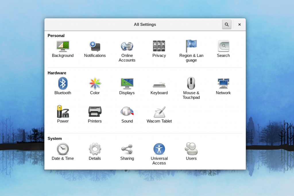
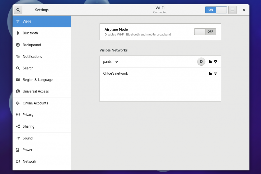
Previously, the Settings application provided navigation between the pages of settings using a grid of icons. In Fedora 27, navigation between the pages is done via a new side panel. This is similar to the layout of the GNOME Tweak Tool, and allows you to quickly and easily switch between pages of settings. Moving away from a gird layout, the settings application window is now resizeable and does not feel as cramped as in previous releases.
-
- Settings in Fedora 26 and older
-
- New Settings in Fedora 27
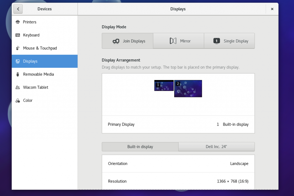
Display Configuration
The display configuration page is completely revamped in Fedora 27 / GNOME 3.26. It now provides all the settings for configuring multiple monitors on a single page. The previous incarnation of this page required the user to drill down to change settings, and this revised layout makes it much quicker and easier to configure multiple monitors.
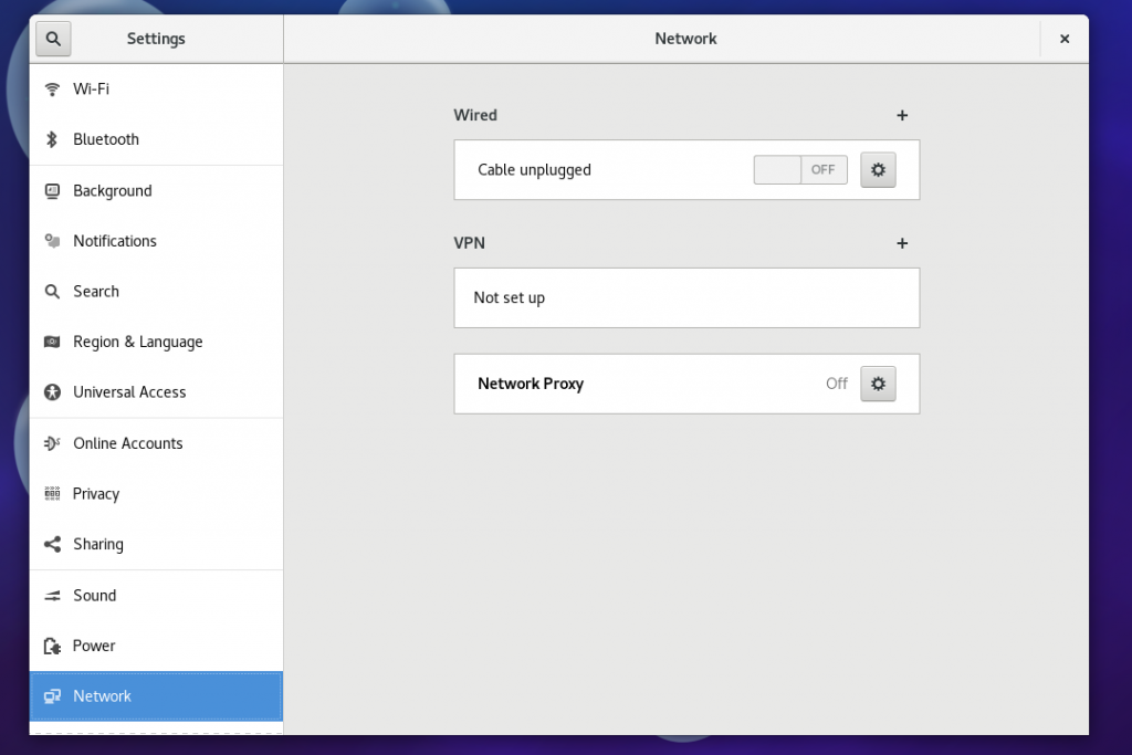
Network settings
The networks settings page is reworked in Fedora 27. The WiFi settings have their own page, and the network settings page is simpler and easier.
Taking a test drive
Fedora 27 includes the refreshed Settings Application (scheduled for release later in 2017). If you want to try out the new settings application, download a beta release of Fedora 27. Alternatively, if you can upgrade your current system to the Fedora 27 Beta.

Dan
The side panel navigation may have better usability, but the icons were prettier. Looks very drab now.
Scott
Have to agree. I’ll hold judgment until I use it but a splash of color might help.
Paweł
I dissagree. It’s toned down and homogenous, similar to android 8 settings app design. So it looks more integrated and compleete from a design stand point. Just my opinion.
alex
That makes me not want to use the device. Its so dull, I want to put it down, stop working, walk away. Colorful buttons inspire me to interact with them, helping me to continue being motivated working with task at computer.
Mehdi
Awesome!
Osqui
Thanks for your work but…
Why “Wifi” is outside of “Network”? It lacks consistency…
On the other hand, why “Date&Time” and “Users” are inside “Details”?? Oh, my…
It’s a horrible classification
Paweł
Yes, it’s not great at the moment. But fortunately you can just start typing and jump to a desired setting very quickly and easily.
Emily
Looks like the one from KDE 5.11 now. Lol
Leslie Satenstein
We seniors (getting close to 80yrs young) get accustomed to one format, and whamo, here is a new innovation.
I love this new layout. Its easy to use, has both icons (left margin) and text.
I transistioned to the Fedora 27 beta. Fedora 27 with the above layout is great, really great.
And the rest of Fedora27 beta’s new improvements match. Fedora 27-beta is much much better than Fedora 26.
Release Fedora 27 early, Its great now! I’ve been using it for around 20 days, without any issues whatsoever.
The C/C++ compiler, javascript, etc. are much improved over the respective Fedora 26 versions.
If I had one wish for a future new system tray, that would be to add dnfdgagora, tweaktool, and similar items to an extra entry.
Alejandro Nova
dnfdragora and all the Drakes can be adopted. It would be awesome for Fedora to adopt the best Mandrake Linux had, and integrate it into the GNOME Desktop.
hc
I have good expierence with 27beta, just found one issue …. I start SMPlayer, then I choose “Edit toolbar” and when I try to move with mouse some option, it will freeze (still can press Esc to unfreeze). In Fedora 26 no problem, I think because of there is Qt 5.9.1 and in 27beta 5.9.2
Robin
80yrs old and this cool..
Rasmus Kaj
I was under the impression that changing the base font size for the desktop (and therefore sizes of icons and borders and anything) would be easier in this upcoming gnome release, but I didn’t find anything like that when I tested the “live” beta. Is tweak tool (still) needed to get readable fonts if you happen to have smaller than average pixels, or is there something nice I’m missing?
Carlo
Yes, you still need gnome-tweak-tool to make those changes and it is not installed by default in fedora. I still suffer from not having a method to use the same font in the apps and the shell without the need to edit the CSS file…
Carlo
Has the network/wifi panel lost the ability to connect to hidden networks and easily create a hotspot? really?
I would like to see a panel dedicated to input devices (cameras, scanners, etc.). I really like the new design but I hope that some panels didn’t lose functions that they had in the previous version.
Owen
There is a control to add hidden networks; create a hotspot and edit known networks in the WiFi panel; its the easy to miss button next to the on/off slider. Another UI fail.
Speaking of Fails; There is no apparent way to manage multiple interfaces, create bridges, virtual networks or tunnels in the Networking screen. I can workaround on the cmdline, but not everybody can or wants to .
Paul W. Frields
@Owen: A graphical UI is not the place to do everything. People who want complex networking setups are almost unanimously comfortable with the command line. There’s no need to shove all those functions into a UI for them, especially since their needs are often too specific or unique to cover well there.
Paweł
I agree with Owen about the “plus” button to add new network. It looks like it’s just part of the background, without hovering it with mouse I wouldn’t know it’s a button. IMHO this can and should be fixed by always displaying “plus” button as it lookls like when hovered.
alex
I had to look several times to find the “plus button” you are talking about. That is definitely background, maybe label at best. I would not even attempt to hover over it, unless reading explicit instructions, like in this forum.
I do not understand why I must constantly flail my hand across entire screen to discovery interactive components. My hand is at rest, or even off the mouse completely, as I think about whats in front of me and plan my hand motion. So if it does not look like a button, I will never consider moving my mouse in that area.
Carlo
Thank you
Ryan Lerch
Hi Carlo!
It is still possible to both connect to a hidden wifi and create a hotspot with the new Settings app. These settings are in the “hamburger menu” (i.e. the button with the ☰ icon).
Paweł
It’s the only hamburger menu in the Settings app. I don’t like this approach, it’s unnecessary in my opinion to hide those 3 settings (connect to a hidden network, hotspot and known networks).
Kiren
Why is the gnome-tweak-tool not standard or built into the base release, why do we need to install it separately?
Murpholinox Peligro
I like it…