A ‘major rebranding effort’ is underway at Canonical and it could result in substantial changes to the logos, icons, and colours we currently associate with Ubuntu.
Word of the new work is nestled inside of the latest Design and Web team summary blog post. There, Canonical’s Anthony Dillon reveals that the brand team is “working on new logos” as part of a wider visual revamp affecting many (if not most) of Canonical’s products and services.
That includes Ubuntu, of course.
The web team says it is collaborating with the brand team to work out how “…the new logos and Brand direction might affect existing navigation components and headers on our sites”.
And to whet our collective appetites Anthony Dillon shares this mockup from exploratory sessions thus far:
Do you notice the “new” Ubuntu logo in the navigation bar?
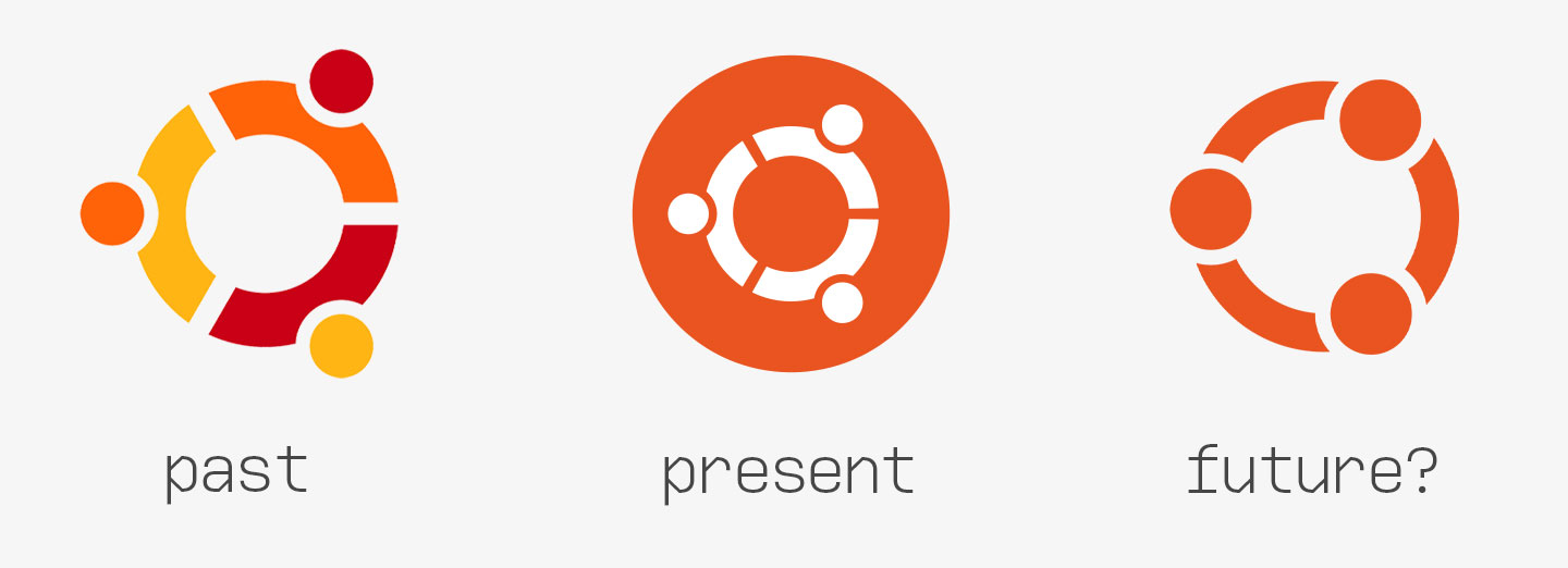
Below you can see the enigmatic new emblem next to the circle of friends (CoF) icon created in 2004, and the ‘current’ version of the CoF that rolled out in 2010:
So what exactly are we looking at?
Well, it could be that this newly-kerned circle-of-friends icon is simply a work-in-progress version; creative exploration; not the final thing. Maybe even an abandoned prototype.
Heck, it could be a decoy placeholder there to avoid spoiling the actual reveal — a red orange herring if you will, one this blogger has fallen hook, line and sinker for!
But that doesn’t square away neatly. The fact that the Ubuntu design team is not using the current Ubuntu logo in their designs is …telling. After all, if there are no plans to change the Ubuntu logo, why not use the current one?
A more emotive representation?
At first glance the new ‘circle’ logo feels like a dramatic departure from Ubuntu’s brand identity. But when you look closer it starts to feel more… encompassing.
The ‘heads’ of the ‘friends’ are inside the ‘circle’. It reminds me of those early (and retrospectively a bit NSFW) Ubuntu wallpapers where real humans (sometimes clothed, sometimes not) were used to recreate the logo.
Rather than people holding hands the ‘new’ logo — which, again, is not confirmed — shows them linking arms. It’s potentially a more powerful and emotive representation of the interdependency that “Ubuntu” as an OS, platform, community, leader, etc follows.
Nothing is confirmed so don’t get angry/lusty
Surprised by news of a rebranding effort?
Eh, you shouldn’t.
The Ubuntu web and design team has mentioned their efforts around “brand hierarchy” exploration several times, so it’s only logical that Ubuntu features in it to some extent.
How “major” could this ‘major rebrand’ be?
Too early to say.
We do know the rebrand does include a request to remove aubergine (aka purple) accents from the Yaru GTK theme (as we mentioned in our post from yesterday). Chances are that wouldn’t be happening if broader, overarching changes weren’t
There’s a new Ubuntu release arriving in October. Might that be the best place to show off a stunning new look?


