Using Sharp Fonts On A GNOME Desktop
Version 1.0
Author: Falko Timme
You might have noticed that fonts are quite fuzzy on Linux desktops which can make your eyes ache if you have to sit in front of your computer all day long. Font rendering is still a little bit awkward and one of the last weaknesses of Linux desktops. This tutorial shows how you can make GNOME and all GNOME applications (such as Evolution, the file browser Nautilus, etc.) use sharp fonts. In fact, we will use the Microsoft Windows standard font, Tahoma, as the standard font in GNOME, too, which will make the desktop look quite familiar if you are used to working with a Windows desktop.
This document comes without warranty of any kind! I want to say that this is not the only way of setting up such a system. There are many ways of achieving this goal but this is the way I take. I do not issue any guarantee that this will work for you!
1 Preliminary Note
I have tested this on Ubuntu 6.10 (Edgy Eft) and 7.04 (Feisty Fawn), but this should work for any GNOME desktop (except for the part where I install packages - installing packages is distribution-specific, and I don't cover the differences between the various distributions here).
It should be noted that these changes affect only GNOME and GNOME applications - unfortunately other applications such as Mozilla Firefox or OpenOffice will not benefit from them. (If you know how to change that with a simple configuration change, please tell me. But I'm not interested in changing the fonts configuration for every single application.)
I'm going to install the package msttcorefonts in this tutorial which contains most Windows fonts, but not all. Especially the Tahoma font is not included in this package; therefore you need a Windows system (and of course a valid Windows license) to copy Tahoma over to your GNOME desktop.
I've put this tutorial together from various sources I've found on the internet, especially:
- http://ubuntuforums.org/showthread.php?t=20976
- http://textsnippets.com/tag/gnome
- http://fontconfig.org/fontconfig-user.html
- http://wiki.archlinux.org/index.php/XOrg_Font_Configuration
I'd like to thank the authors of the above documents for their work! It's highly appreciated.
2 Comparison Before - After
To give you an impression of what you will get, I'm going to show you the differences with the help of some screenshots in their original size (I haven't resized them as that would distort your impression).
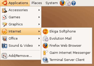
Menu - Before
This is how the fonts in the menu look like now:
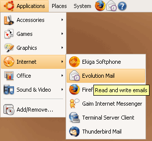
Menu - After
And this is how they will look after your changes. As you see, the fonts are much sharper which is better for your eyes. And as an additional benefit, if you've switched from a Windows desktop, you will feel right at home with the new font as it is the Windows font Tahoma:
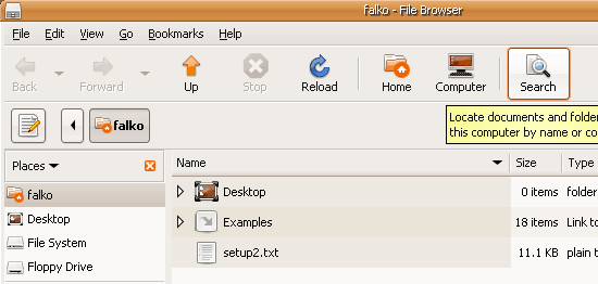
Nautilus (File Browser) - Before
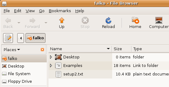
Nautilus (File Browser) - After
Tooltips - Before
Tooltips - After
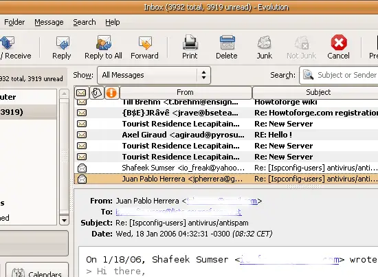
Evolution - Before
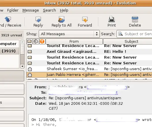
Evolution - After