Skip to content
Biz & IT

Precision and purpose: Ubuntu 12.04 and the Unity HUD reviewed

This release—the first with 5-year long-term support—is rock solid.

Ryan Paul | 184

Ubuntu 12.04, codenamed Precise Pangolin, rolled out last month. The new version of the popular Linux distribution brings updated software and new features, including the highly-anticipated Heads-Up Display (HUD) interface. The HUD is one of several excellent improvements that have helped to make Ubuntu's Unity desktop shell even better in Ubuntu 12.04

When Unity was first unveiled in 2010, it was introduced as a new graphical frontend for the Ubuntu Netbook Remix. Canonical later brought Unity to the desktop, making it the cornerstone of the company's Linux usability enhancement efforts. Ubuntu 11.04 (released last year) was the first version that shipped with Unity as the standard environment on the desktop.

Unity has come a long way since Canonical and the Ubuntu community began working to iron out its rough edges on the desktop. The performance and stability issues that afflicted earlier versions have largely been remedied. It was already in great shape back in October when version 11.10 was released, but it has benefited from further refinement.

The Ubuntu 12.04 desktop

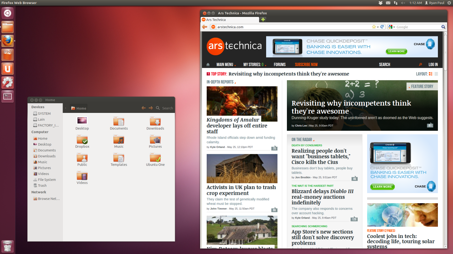
The Unity environment is responsive and robust in 12.04, offering the reliability that one would expect from a mature desktop shell. This important milestone in Unity's development is timely. Ubuntu 12.04 is a long-term support (LTS) release, which means that it will receive updates and commercial support for longer than regular releases. Every fourth version in Ubuntu's six-month release cycle is an LTS release, so a new LTS release is issued once every two years.

In previous versions, long-term support meant three years on the desktop and five years on servers. Canonical has changed the plan a bit for Ubuntu 12.04—it will be the first LTS release to receive five years of support for both the desktop and server flavors. The company is aiming to attract enterprise desktop adopters and OEMs with the extended LTS commitment.

Unity

Although Unity's quality has grown to the point where it fulfills our expectations, the user experience still falls short in a number of ways. We identified several key weaknesses in our last two Ubuntu reviews, some of which still haven't been addressed yet. These issues still detract from Unity's predictability and ease of use.

Global menubar

The global menubar, which is one of the defining characteristics of the Unity environment, still poses a number of problems. The global menu model simply isn’t compatible with the window-specific menu system used in Linux applications. The effort to bolt these conflicting paradigms together could be executed better.

Despite displaying the menu contents outside of the window, the menus are still window-specific. By design, the global menu bar displays the menu of the focused window. This proves awkward in some applications with dialogs and multiple windows.

If you open the file properties dialog in the file manager, for example, the file manager menu will not be accessible in the menu bar until you either close the dialog or switch focus back to a regular file manager window. When you move your mouse into the menu bar, you simply get nothing.

This behavior isn’t consistent throughout the desktop. There are some applications where giving focus to a dialog causes menu items to become inaccessible and some (such as the terminal) where the menu of the parent window remains visible while a dialog has focus. The latter is obviously preferable and should be the standard behavior through the application stack.

Another issue is that application-wide functionality isn’t merged into the menus that are displayed for some child windows. A good example of a window where this issue proves problematic is the Firefox Web browser’s bookmark manager.

If you open the bookmark manager dialog, the global menu bar will display the window’s specialized menu contents. But functionality that is relevant across the entire application, such as the "Quit" and "Help" menu items, isn’t accessible. You have to give a regular browser window focus in order to get back to those items, because they are tied to the menu from those windows.

The Unity menu is displayed globally, but it’s still contextually tied to the window. That’s not going to be obvious to new users, who are going to wonder why the "Quit" menu item goes away when they have a dialog open. There are also ways in which this behavior is annoying for experienced users. The standard Ctrl+Q keyboard shortcut, for example, doesn’t work in Firefox when the bookmark manager has focus.

You can see this phenomenon in several other applications, such as the Empathy instant messaging client that comes with Ubuntu. You don’t get a "Quit" menu item or the Ctrl+Q shortcut when a conversation window has focus because that menu item is part of the menu for the buddy list window.

We’ve been highlighting this problem since our review of 11.04, but it hasn’t been fixed yet. Due to the manner in which the global menu system is bolted into the environment, it’s not clear if there is even a practical solution to the problem. As long as the menus are defined by the individual applications with the assumption that they are tied to a specific window, the problem isn’t going to be trivial to address.

It’s worth noting that GNOME 3 is moving towards a model where window-specific functionality is presented in the window and application-specific functionality is exposed separately in a global menu. Although that approach also poses serious usability problems, as we discussed in our recent GNOME 3.2 review, it potentially offers a way to move towards better global menus.

Assuming that global menus are desirable, the ideal formulation is one in which the application-wide items and window-specific items are merged into a single global menu. The application-wide functionality will remain constant while the window-specific top-level menus will change depending on the window that has focus. Thanks to GNOME’s new approach, there is already a technical mechanism in place for specifying which menu items should be treated as global.

Even if you could achieve the ideal formulation, however, it’s not really clear that global menus improve the user experience enough to justify all this effort. The idea of moving menus out of windows and putting them in a global space made a lot of sense in the Unity netbook environment where the number of vertical pixels is heavily constrained. But it can be downright inconvenient on a conventional computer with a high-resolution monitor or multiple displays.

Aside from the significant functional mismatch between the global menu bar and the way that the widget toolkits handle menus, there are also still a number of annoyances that afflict Unity’s presentation of the menu. The menu fade-in and truncated title discussed in our previous reviews are still disorienting. The fact that the menus aren’t visible until the cursor hovers over them still poses a discoverability problem.

As we wrote in our Ubuntu 11.04 review, the global menu implementation in Unity is far better and more comprehensive than some of the previous hacks offering similar functionality. But it doesn’t fully address all of the behavioral disparities.

Unity Dash

The Unity dashboard (often called Dash) is the translucent overlay that appears when the user clicks the Ubuntu icon at the top of the left-hand dock. It has several switchable views, called lenses, which display different kinds of information and launchers. Dash received a handful of improvements and new features in Ubuntu 12.04.

One of the most noticeable changes is that the home lens has been redesigned. In the previous version of Ubuntu, the home lens had a grid of eight large icons. The top four were shortcuts to the main Dash features and the bottom four were launchers for common activities.

Instead of the eight static icons, the new home lens displays recent items. The layout consists of two rows. The first row shows launchers for applications that have been recently used. The second row shows documents and files that were recently opened. Although the contents it exposes are also available on the dedicated file and application lenses, it’s useful to have the combined view of recent items available in the home lens.

The new Home lens in Unity's Dash

The application lens is largely the same as it was in the previous version, but it got one minor improvement that I’ll cover momentarily. The application lens consists of three sections: applications that have been recently used, applications that are installed, and applications that are available from the Software Center.

In previous reviews, I’ve complained about the irritating and superfluous Software Center section of the application lens. It displays an inexplicable smattering of random items, most of which have hideous icons. The Ubuntu developers understandably want to increase the visibility of the Software Center, but the way it is integrated in Dash is absurdly unhelpful.

Thankfully, the application lens in 12.04 has a new Sources toggle in the filtering pane. This allows the user to optionally hide the Software Center section. It's a very welcome improvement for those of us who want to dial back on clutter in the Dash.

The Unity application lens, with the sources hidden

A new music lens was introduced in Ubuntu 11.10, with support for displaying the user’s music library. It also has a mechanism for accessing Canonical’s integrated music store, allowing the user to search for songs and albums that are available for purchase. Building on media library theme, Ubuntu 12.04 adds a video lens.

The new video lens allows the user to search for videos from a variety of popular streaming sites and on-demand video services, including YouTube, Vimeo, Dailymotion, Amazon, and Vodo. The lens also has a section for local video content, which picks up files stored in the Video folder within the user’s home directory.

Searching for Star Trek in Unity's new video lens.

The video lens search tool isn’t particularly good, often returning results of questionable relevance. As you can see in a screen shot, the results seemed a bit random when I did a search for Star Trek. It worked relatively well for finding cat videos on YouTube, however.

Canonical unveiled a dedicated Ubuntu television platform earlier this year, which is intended for adoption by television and set-top box manufacturers. As we described in our hands-on review, it offered a good range of specialized video functionality. The video lens in 12.04 appears to be a lot simpler though less comprehensive.

It’s possible that some features from Ubuntu TV will be brought over to the standard Ubuntu video lens in the future as the platform matures. It’s worth noting, however, that the Ubuntu TV environment is implemented on top of the Qt-based Unity 2D shell implementation. The code can’t be ported over directly to the standard Unity environment.

Unity HUD

Unity’s new Heads-Up Display (HUD) is arguably the most highly-anticipated new feature in Ubuntu 12.04. It extends Unity with a new command-driven keyboard interface for activating menu items. The result is faster and more convenient access to application functionality from the keyboard, a very welcome improvement for advanced users who like to squeeze every last drop of productivity out of their desktop.

The HUD interface is built into the Unity Dash. Tapping the alt-key on the keyboard activates it. The HUD will slide down from the top of the screen and display a large empty text box into which the user can type an instruction. As the user types, the HUD will display a vertical list of available commands and highlight the best possible match. The user can hit enter to activate the highlighted command or use the mouse or arrow keys to select a different item from the list.

The available commands are populated from the current window’s menu. The HUD does fuzzy matching to show all of the menu items that are applicable to the text typed by the user. The menus are essentially flattened, so you can access items at any level of depth in the menu hierarchy.

Typing a command into Unity's new Heads-Up Display.

The list will show the full name of each menu item, including the name of all of its parent items, delimited by the greater-than sign. For example, the menu option to toggle the visibility of the bookmarks toolbar in Firefox, which is in under the Toolbars submenu of the View menu, is listed as "View > Toolbars > Bookmarks Toolbar."

In addition to the menu items from the current window, the HUD will also provide access to the items from Unity menu indicators. These are the persistent system menus that appear on the right-hand side of Unity’s top panel. You can, for example, use the HUD to activate the Log Out menu item from the system gear menu.

The HUD is powered by the same mechanism that supports Unity’s global menu system. In order to make an application’s menus available to Unity so that it can display it in the panel, the contents of the menu are relayed over the D-Bus interprocess communication system. The HUD taps into that data, essentially offering an alternate presentation of the menu. In addition to being extremely useful, the HUD is a compelling illustration of how Unity’s architectural strengths can be put to use in novel ways.

An advantage of using the D-Bus menu system is that the HUD will be able to access practically anything that can be displayed by the global menu bar. The HUD can even handle dynamically-populated menu items, such as the contents of the user’s bookmarks and history menus in Firefox.

Firefox bookmarks are searchable in the Unity HUD because they each have a menu item.

It’s possible for Ubuntu’s developers to expand on the HUD feature set in future versions of Ubuntu, allowing applications to expose custom commands and other capabilities outside of the current menu feature set. The HUD could become like a universal command system for the Ubuntu desktop.

It’s important to note that the HUD is an entirely optional feature. The existing menu system remains completely intact, so users who don’t want to use the keyboard won’t have to change how they work. It’s an extra capability that will largely benefit power-users.

I typically prefer to use the standard keyboard shortcuts for the operations that I perform frequently, but I’ve found that the HUD is really useful for the long tail of other operations that I use less frequently. Another really great advantage of the HUD is that it saves the user the trouble of having to figure out what menu a particular feature is located in. I can just start typing the name and access it almost instantly instead of having to mouse over two or three menus and associated submenus.

The HUD is an excellent addition to Unity. It’s also arguably the best and most impressive new feature in Ubuntu 12.04. Although it’s already quite useful, there is a lot of potential for future enhancement. We are really looking forward to seeing how it continues to evolve in future releases.

It also dulls some of my frustration with the global menu system. Global menus are still not a good fit for a Linux desktop, but the advantages offered by the HUD, which is built on top of the same mechanism, offset the annoyances that afflict the global menu bar implementation.

System Settings

As some of you might remember from my previous Ubuntu reviews, there are a number of changes that I like to make to the default Unity configuration. In particular, I like to shrink the size of the dock icons so that it takes less horizontal space and more of them can fit on the screen at the same time.

In previous versions of Ubuntu, users typically had to rely on the CompizConfig Settings Manager (CCSM) in order to adjust the icon size and other aspects of Unity’s behavior. This is because the Unity dock and several other components of the environment are implemented as plugins of the Compiz window manager.

CCSM is an elaborate tool that attempts to expose virtually every configurable aspect of Compiz and its enabled plugins. It’s quite powerful, but it’s not really something that regular end users should have to contend with in order to make minor adjustments to Unity. Fortunately, the appearance configuration applet in the standard System Settings tool has gained support for managing several critical Unity settings in Ubuntu 12.04.

The System Settings tool, which Ubuntu inherits from upstream GNOME, is a single application that brings together all of the standard GNOME desktop preference tools in a unified user interface. The Ubuntu developers have made a number of customizations to the System Settings tool to expose distribution-specific capabilities.

The appearance configuration applet, which allows the user to set the desktop wallpaper and widget theme, has been extended so that it can be used to manage several features of Unity. At the bottom of the window, there is a new slider that lets the user adjust the size of the launcher icons in the dock.

The icon size is measured in pixels. It can be set as low as 32 and as high as 64. The default setting, which is marked with a notch under the slider, is 48. The rather large default size would likely be desirable on a touchscreen device, but it seems a bit large for the desktop. I personally like to drag it down to 36, which seems like the most comfortable size on a large screen.

The Unity dock, configured to be 32-pixels wide.

The appearance configuration applet has also gained a new "Behavior" tab that allows the end user to enable automatic hiding for the Unity dock. This will cause the dock to temporarily disappear from view. The dock will show again when the user moves their cursor to the screen edge or performs a keyboard shortcut that accesses dock functionality.

Enabling the Unity dock's autohiding feature.

Even though I’ve always personally liked CCSM (something about its multitude of highly granular configuration fields appeals to my obsessive-compulsive personality), it’s the antithesis of usability. Making the relevant Unity settings accessible to users in the platform appearance preferences is a very welcome usability improvement.

It’s worth noting, however, that there are still many aspects of Unity that still can’t be configured. For example, the dock is fixed in place on the left-hand side and can’t be moved to any other position on the screen.

Privacy

Ubuntu comes with a sophisticated framework called Zeitgeist that tracks user activity, comprehensively logs the data, and analyzes it to map relationships between aspects based on various parameters. Zeitgeist provides APIs that make its data available to other applications, which can then use it to provide contextually relevant functionality.

Zeitgeist is extraordinarily powerful and can be put to use in many different ways, but its most common service is providing the platform with information about what files and applications are used frequently and have been accessed recently. Unity’s dashboard, for example, uses Zeitgeist to populate some of the data in the file lens and application lens.

Zeitgeist operates entirely on the user’s computer, so the data is never transmitted to a remote third-party or mined for questionable purposes. But the nature and scope of the data collected by Zeitgeist may still pose some concerns for privacy-conscious users. To address that issue, the Zeitgeist developers created a privacy tool that can adjust and manage Zeitgeist data collection.

The privacy management features were integrated into the System Settings tool, which makes them easily accessible to users in Ubuntu 12.04. They got their own dedicated configuration applet called Privacy that is displayed in the top row of the System Settings grid.

At the bottom of the Privacy configuration applet, there is a "Record Activity" switch that can be used to globally toggle Zeitgeist activity tracking. Zeitgeist will stop recording data when the user moves the switch to the OFF position. It will resume when the switch is flipped back to the ON position.

In addition to the toggle switch, the Privacy configuration applet also has a number of other mechanisms to manage their Zeitgeist history and control activity tracking. One of the available features allows the user to delete Zeitgeist history for a specified duration, ranging from an hour to everything.

Deleting Zeitgeist history.

The tool also allows users to specify file types, applications, and folders that they don’t want Zeitgeist to monitor. You could, for example, configure it to ignore the shuddering cyclopean abyss of your Lovecraft-themed pornography directory so that your friends won’t discover your fetish for eldritch monstrosities when they gaze into the maw of your recent file list in Unity.

Configuring Zeitgeist's privacy settings.

The inclusion of the new Zeitgeist settings in Ubuntu 12.04 has drawn praise from privacy advocates. The Electronic Frontier Foundation (EFF), a well-known Internet rights group, highlighted the Privacy configuration applet in a blog entry earlier this year. They correctly pointed out, however, that it’s not a comprehensive solution for managing privacy on Ubuntu.

The Privacy configuration applet only controls Zeitgeist; it doesn’t affect other applications, which may be performing their own logging. When the user clicks the checkbox in the Privacy tool that tells it not to track instant messaging, for example, it just prevents Zeitgeist from monitoring how the user converses. Empathy’s chat logging still has to be controlled separately through the Empathy preference dialog.

In its blog entry, the EFF characterized the introduction of system-wide privacy settings for Zeitgeist as a step in the right direction. The EFF said that that it would like to see Ubuntu go further and provide centralized management for all logging and tracking behavior across the platform. Such a task could possibly be achieved by establishing standardized cross-desktop APIs (presumably through FreeDesktop.org) that can be adopted by applications.

We share the EFF’s enthusiasm for better privacy controls. Although the Ubuntu community has only modest influence over how applications are implemented in the broader Linux desktop ecosystem, we’d really like to see Canonical and Ubuntu make a focused effort to collaborate with additional upstream developers to continue improving user privacy.

Ubuntu’s scrollbars

Ubuntu has a custom scrollbar interface widget that was first introduced in version 11.04. Instead of the traditional wide scrollbar with arrow buttons at the top and bottom, Ubuntu has a slender orange line that appears along the inside edge of the associated scrollable pane.

When the user places the cursor over the line, a pair of floating arrow buttons will appear alongside. The user can scroll by clicking or dragging the arrow buttons. The scrollbar will remain visible at all times, but will fade to a light gray color in windows that don’t have focus.

It is a little bit like the scrollbar design that Apple later adopted in Mac OS X Lion, but there are a number of differences in behavior. Ubuntu’s implementation doesn’t have the elastic overshoot, for example. Ubuntu’s floating arrow buttons and scrollbar persistence are other points of differentiation.

Unity's overlay scrollbar. The cursor isn't shown in the screenshot, but it's hovering over the space where the arrows appear.

In my review of Ubuntu 11.04, I explained that I appreciate the unobtrusive visual style of the new scrollbar design, but found the floating arrow buttons a bit cumbersome to use. The button issues haven’t been much of a problem for me in practice. As a touchpad and trackball user, I rarely need to click and drag to scroll.

A number of subtle improvements to the behavior of the scrollbar implementation in Ubuntu 12.04 have made the arrow buttons friendlier. The changes are all somewhat trivial individually, but they add up to a much better user experience in concert. Some of the changes include the introduction of a middle-click jump feature, smooth animations for the scroller, and better proximity checking for determining when to show the floating buttons.

After several weeks of testing, I have found that I actually prefer the scrollbar widget design in 12.04 to that of Mac OS X Lion. The Ubuntu approach makes it easier to click and drag the bar when the need arises because the floating buttons offer a big target that is easy to hit. The persistent visibility of the Ubuntu scrollbar is also a win. You can always easily see where you are in a scroll buffer, but the indicator is still unobtrusive and doesn’t waste screen space. It serves as a good example of an area where Ubuntu is genuinely raising the bar for user interface design.

Rhythmbox

Ubuntu’s software lineup evolves from one release to a next. Canonical’s technical and business requirements obviously play a factor in driving the changes, but the decisions about what applications to include in the default installation are largely made in collaboration with the community through a consensus-driven process during a session at the Ubuntu Developer Summit.

Sometimes changes to the default application stack remain permanent, other times they get reversed or changed again after only a few release cycles. One of the most notable changes in the Ubuntu 12.04 software lineup is that the default music player has been switched back from Banshee to Rhythmbox.

Rhythmbox is the standard music player of the upstream GNOME environment. It has a relatively comprehensive audio feature set, including support for library management, accessing networked music shares, subscribing to podcasts, listening to Internet radio, interacting with iPods and MTP devices, and using Last.fm. It also has a plugin system, optional Zeitgeist integration, and support for relevant cross-desktop standards such as MPRIS.

The Rhythmbox music player

Banshee is an alternate GNOME-based music player that has largely been sponsored by Novell. It is intended to serve as a complete media library management tool, with support for video in addition to audio. Its audio feature set is largely comparable to that of Rhythmbox, but with slightly more polish and completeness. Subjectively, we think that Banshee’s more streamlined user interface is nicer and offers better usability than that of Rhythmbox.

Ubuntu had originally switched from Rhythmbox to Banshee a year ago for the 11.04 release. The change had strong support at the time, largely due to Banshee’s technical merits and considerable popularity among Ubuntu contributors. The decision to switch back to Rhythmbox in 12.04 was motivated by several factors. The main issues involved Banshee’s Gtk+ 3.0 migration path and concerns about the reliability of Banshee on ARM hardware.

ARM support is increasingly important to Canonical, especially in light of the company’s mobile ambitions. It’s unsurprising that ARM compatibility is becoming a higher priority than it traditionally has been in the past. The Gtk+ 3.0 migration issue largely relates to the C# binding availability.

Banshee is written in C# and runs on Mono, an open source implementation of the .NET platform. In order to migrate to the new version of the Gtk+ toolkit, proper C# bindings had to be supplied first. There were some unanswered questions about whether said bindings would be mature enough.

Comparing the overall suitability of Rhythmbox and Banshee for music library management and playback, it’s hard to make a strong case for one over the other. Where Banshee really shines is its highly modular architecture and rich extensibility. These are technical characteristics that make it a good fit in environments where you want the user’s media library to be more tightly integrated into the desktop user experience.

You can see a compelling example of Banshee desktop integration in action if you take a look back at the now-abandoned MeeGo netbook environment. Building on top of Banshee, the developers exposed the user’s multimedia library through the Clutter-based MeeGo desktop shell. It seemed like there was a lot of potential for Ubuntu to take similar steps with Unity, leveraging Banshee’s powerful infrastructure to bake media management directly into the environment.

It’s a bit disappointing that Ubuntu developers never really took advantage of Banshee’s strengths. But because they chose not too, it means the transition to Rhythmbox doesn’t represent a major loss for Ubuntu. I suspect that the vast majority of regular end users don’t have a strong preference in one direction or the other.

Banshee is, of course, still available in the Ubuntu package repositories for users who want to install it. I happen to really like Banshee, but Rhythmbox serves my needs well enough that I didn’t really feel compelled to go through the effort of installing Banshee right away. The main things that I miss from Banshee when I use Rhythmbox are purely aesthetic: Banshee’s slick album list display and the way the playback slider is integrated into the main toolbar.

Testing Ubuntu on hardware

I conducted extensive testing of Ubuntu 12.04 on several different computers. When I test a new version of Ubuntu in preparation for a review, I first use the update manager to upgrade all of my computers. Then I reformat them all, and finish with a fresh installation. This approach gives me an opportunity to test both the installer and the upgrade process on several pieces of hardware. The review itself is always based on testing that has been conducted on a completely clean installation.

My two main test systems are an Atom netbook and a desktop PC with a six-core i7 CPU and 16GB of RAM. Ubuntu’s version-to-version upgrade process is typically pretty good. I haven’t encountered any issues with it during the last several releases.

In this case, however, my desktop computer didn’t take it well. The upgrade appeared to complete as expected, but I encountered problems after rebooting. The login screen was being displayed at the wrong resolution and my wireless keyboard and mouse weren’t recognized. I wasn’t able to trivially resolve the problem.

When I followed that up with a fresh installation, I ran into a minor issue with the installer. The system has two hard drives, one with Windows and one for Ubuntu. When I let the installer automatically replace the existing Ubuntu installation, it installed the boot loader on the wrong drive. When I did the installation a second time with manual partitioning and set the correct drive on which to install the boot loader, it worked properly.

On the netbook, an HP mini, I experienced no difficulties with either the upgrade or fresh installation. Hardware compatibility on the netbook seems to be largely unchanged from 11.10. The wireless component worked right out of the box and was fully functional during the installation process. The netbook’s built-in webcam also worked right out of the box.

As some readers might recall, I complained about problems with touchpad support in my 11.10 review. My netbook has a Synaptics clickpad, which has historically not worked particularly well under Linux. Support for Synaptics hardware has improved in 12.04, but it’s still not as good as it is on Windows. I used the System Settings tool to disable tap-clicking, a change that improved the situation considerably. Drag-and-drop is still problematic, however, and doesn’t work quite as well as it should.

I also had especially poor battery life on the netbook in 11.10, which I suspected was caused by excessive resource consumption in Compiz. The problem seems to have been resolved, because I didn’t encounter similar issues in 12.04. It’s worth keeping an eye on, however, because results may vary depending on graphics hardware. On some hardware configurations, you might get better battery life by switching to Unity 2D, as I did on my netbook for 11.10.

Linux hardware support and installation is easier than it has ever been, but there are still a range of minor problems that can surface. Users who are buying highly conventional mid-range desktop towers or known-good hardware specifically for Linux will have little to worry about. Challenges may arise on many laptops and more exotic desktop configurations.

I’m not all that concerned about the anomalous upgrade problem that I had on my desktop computer–I haven’t seen anything like it recently and it doesn’t appear to be reproducible. The installer putting grub on the wrong drive, however, seems really shoddy.

I thought at first that the boot loader installation glitch might have occurred because I was installing over the failed upgrade, but it seems to do it consistently on the computer in question. A bit of searching showed that others have also experienced the same issue. Although the Ubuntu installation experience is generally very good, I was disappointed to see a bug of that nature in an LTS release.

Conclusion

There are a few minor, new features and changes that we didn’t cover in this review. One area of particular relevance that I want to briefly address is Ubuntu One, Canonical’s synchronization service. It has been overhauled with a new client interface and a number of other functional changes.

I had originally planned to discuss that in this article, but I’ve decided that I want to save it for a follow-up. Rather than looking solely at how the Ubuntu One user experience has evolved on the Ubuntu desktop, I want to take a closer look at it holistically as a cross-platform service. You can expect to see that follow-up in the near future.

Ubuntu 12.04 isn’t a particularly ambitious update. The number of major changes is relatively small because the focus of development was on stabilization and refinement, as you would expect for an LTS release. That effort has clearly had a positive impact on Unity, which offers excellent performance reliability in Ubuntu 12.04.

Aside from the minor issue that I ran into with the installer, I think that Ubuntu 12.04 is a solid release. It’s definitely one that the LTS audience can install with confidence and expect to hold up well for several years.

For those of us who are updating every six months to get the latest shiny features, the biggest win in Ubuntu 12.04 is the new Unity HUD. Its convenience offers a genuine productivity boost for users who are comfortable with the keyboard. It’s a good, creative desktop augmentation that caters to power users and highlights technical strengths of Unity’s architecture.

Although I’m really pleased with the quality of Ubuntu 12.04, I think there are still design issues in Unity that need to be addressed. Some of the behaviors of the global menu bar stand out as areas that particularly need more thought and attention. Reinventing the Linux desktop is a worthy ambition, but trying to make longstanding platform conventions conform with designs that are wildly incompatible is not going to move the desktop forward.

Ubuntu 12.04 is available for download from the Ubuntu website. Several other flavors are also available, including Ubuntu Server and the KDE-based Kubuntu. These are all available in 32-bit and 64-bit varieties. Development has already begun on the next major version. Ubuntu 12.10, which is codenamed Quantal Quetzal, will be released in October.

Photo of Ryan Paul
Ryan Paul Ars Editor Emeritus
Ryan is an Ars editor emeritus in the field of open source, and and still contributes regularly. He manages developer relations at Montage Studio.
184 Comments